
Power BI vs Tableau: Choosing the Right Data Visualization Tool
Power BI vs Tableau: In today’s data-driven world, choosing the right data visualization tool is crucial for making informed decisions and gaining valuable insights. Both Power BI and Tableau are powerful platforms, but they cater to different needs and preferences.
Let’s dive into the intricacies of these tools and explore which one might be the perfect fit for your data visualization journey.
Power BI, developed by Microsoft, and Tableau, a product of Tableau Software, are leading players in the data visualization landscape. Both offer a wide range of features, including data connectivity, data preparation, visualization options, and interactive dashboards. However, their strengths and weaknesses lie in different areas, making the choice between them dependent on your specific requirements.
Data Visualization: Power BI vs Tableau
In today’s data-driven world, data visualization tools are crucial for turning raw data into actionable insights. These tools empower businesses to understand trends, identify patterns, and make informed decisions. Power BI and Tableau are two popular and powerful data visualization platforms that have revolutionized the way businesses analyze and interpret data.
Power BI and Tableau: An Overview
Both Power BI and Tableau are comprehensive data visualization platforms offering a wide range of features and functionalities. They cater to various data analysis needs, from simple data exploration to complex predictive modeling.
- Power BIis a business intelligence and data visualization tool developed by Microsoft. It provides a comprehensive suite of features for data analysis, reporting, and sharing insights.
- Tableauis a data visualization platform developed by Tableau Software. It is known for its user-friendly interface and powerful data exploration capabilities.
Key Features and Capabilities

Power BI and Tableau are two of the most popular data visualization tools available today. Both offer a wide range of features and capabilities that allow users to connect to data sources, prepare and clean data, create compelling visualizations, and share insights with others.
While both tools are powerful and versatile, they have their own strengths and weaknesses, making one a better choice for certain use cases than the other.
Data Connectivity, Power bi vs tableau
Data connectivity refers to the ability of a tool to connect to various data sources, including databases, spreadsheets, cloud services, and other data repositories.
- Power BIoffers a wide range of data connectors, allowing users to connect to various data sources, including on-premises databases (SQL Server, Oracle, MySQL), cloud-based services (Azure SQL Database, AWS Redshift), and file formats (Excel, CSV, JSON). It also supports direct query, which allows users to query data directly from the source without having to import it into Power BI.
- Tableaualso provides a wide range of data connectors, including connections to databases (SQL Server, Oracle, PostgreSQL), cloud-based services (Amazon Redshift, Snowflake), and file formats (Excel, CSV, text files). Tableau’s data connectivity is particularly strong for connecting to cloud-based data sources, thanks to its integration with cloud platforms like AWS and Azure.
Both Power BI and Tableau excel in connecting to a wide range of data sources, making them suitable for various data analysis needs.
Data Preparation
Data preparation is the process of cleaning, transforming, and shaping data to make it suitable for analysis and visualization.
Choosing between Power BI and Tableau is like picking your favorite nail polish. Both offer stunning visualizations, but the choice ultimately comes down to personal preference and the specific needs of your project. If you’re looking for a tool that offers a wide range of customization options and a deep dive into data, then Power BI might be your best bet.
But if you prefer a more user-friendly interface and a focus on creating eye-catching dashboards, then Tableau might be the better choice. Just like you can’t go wrong with a swipe of holographic and iridescent nail polish , both Power BI and Tableau have their own unique strengths and weaknesses, making the decision a matter of personal taste.
- Power BIoffers a powerful data transformation engine called Power Query, which allows users to clean, shape, and combine data from multiple sources. Power Query provides a rich set of data transformation functions, including filtering, sorting, merging, and grouping data.
- Tableauprovides a visual data preparation interface called Tableau Prep, which allows users to clean, shape, and blend data using a drag-and-drop interface. Tableau Prep is designed to be user-friendly, making it easy for users to prepare data without writing code.
Power BI’s Power Query and Tableau Prep offer different approaches to data preparation, with Power Query providing a more code-based approach and Tableau Prep offering a visual, user-friendly experience.
Visualization Options
Visualization options refer to the various chart types and visualization techniques that a tool offers for representing data.
- Power BIprovides a wide range of visualization options, including standard chart types (bar charts, line charts, pie charts), advanced visualizations (maps, scatter plots, treemaps), and custom visualizations created by the community.
- Tableaualso offers a wide range of visualization options, including standard chart types, advanced visualizations, and custom visualizations. Tableau is known for its flexibility and ease of use, making it easy to create visually appealing and informative visualizations.
Both Power BI and Tableau offer a wide array of visualization options, allowing users to choose the most appropriate chart type for their data and analysis needs.
Interactive Dashboards
Interactive dashboards are dynamic and interactive displays that allow users to explore data, filter visualizations, and drill down into details.
- Power BIprovides a comprehensive dashboarding experience, allowing users to create interactive dashboards with various visualizations, filters, slicers, and drill-down capabilities. Power BI dashboards can be easily shared with others, enabling collaborative data exploration and insights.
- Tableaualso offers robust dashboarding capabilities, allowing users to create interactive dashboards with visualizations, filters, and drill-down features. Tableau dashboards are known for their aesthetic appeal and ability to create engaging and interactive user experiences.
Both Power BI and Tableau excel in creating interactive dashboards, providing a rich experience for data exploration and insights.
Ease of Use and Learning Curve: Power Bi Vs Tableau
Choosing the right data visualization tool often boils down to how easy it is to learn and use. Both Power BI and Tableau are popular choices, each catering to different skill levels and user preferences. Let’s explore their ease of use and learning curves to help you make an informed decision.
User Interface and Design
The user interface (UI) plays a crucial role in determining how intuitive and user-friendly a tool is. Both Power BI and Tableau offer visually appealing interfaces, but their approaches differ:* Power BI:Power BI’s UI is modern and clean, featuring a ribbon-like menu with clearly labeled icons.
The interface is well-structured, making it easy to navigate and find the features you need.
Tableau
Tableau’s UI is more traditional, with a menu bar and a toolbar that offers a wide range of options. It might take some time to get used to the layout, especially for beginners.
Drag-and-Drop Functionality
Drag-and-drop functionality is a key feature that simplifies data visualization. Both Power BI and Tableau excel in this area:* Power BI:Power BI’s drag-and-drop functionality is intuitive and straightforward. You can easily drag fields from your data source to create charts and dashboards.
Tableau
Tableau is known for its robust drag-and-drop capabilities, offering a wide range of options for customizing your visualizations. It allows you to quickly create interactive dashboards and reports with just a few clicks.
Learning Resources
The availability of learning resources is essential for mastering any tool. Both Power BI and Tableau offer extensive resources to help users learn and grow:* Power BI:Microsoft provides comprehensive documentation, tutorials, and online courses for Power BI. There are also numerous community forums and online resources dedicated to Power BI.
Tableau
Tableau offers a wealth of resources, including a dedicated website with tutorials, training videos, and a certification program. The Tableau community is also very active, providing support and guidance.
Target Audience
The ease of use and learning curve of a tool often dictates its target audience. Here’s a breakdown of the typical users for each platform:* Power BI:Power BI is well-suited for individuals with a basic understanding of data analysis and visualization.
It’s an excellent choice for business users, data analysts, and anyone looking for a user-friendly tool with a gentle learning curve.
Tableau
Tableau is often preferred by experienced data analysts and data scientists who require more advanced features and customization options. It’s also popular among data visualization professionals and organizations with complex data analysis needs.
Choosing between Power BI and Tableau can feel like picking the perfect handbag – both have their strengths! Just like I’m obsessed with the sleek design and functionality of the Tory Burch Just Kira tote , I’m drawn to the user-friendliness of Tableau for its visual appeal.
But for a data-driven approach with powerful analysis capabilities, Power BI might be the better choice. Ultimately, it’s about finding the tool that best fits your needs and style!
Data Integration and Connectivity

Both Power BI and Tableau excel in connecting to various data sources, making them valuable tools for analyzing data from diverse origins. This section explores the data integration capabilities of both platforms, comparing their compatibility with different data sources and analyzing their strengths and weaknesses in handling large datasets and complex data transformations.
Data Source Compatibility
Power BI and Tableau offer extensive connectivity options, enabling users to access data from a wide range of sources.
- Databases:Both tools support connections to various databases, including relational databases like SQL Server, Oracle, MySQL, and PostgreSQL, as well as NoSQL databases like MongoDB and Cassandra.
- Spreadsheets:Both platforms can directly connect to Excel spreadsheets, allowing users to analyze data stored in familiar formats.
- Cloud Services:Power BI and Tableau integrate with popular cloud services like Azure, AWS, Google Cloud Platform, Salesforce, and Dropbox, providing access to data stored in the cloud.
- Other Data Sources:Beyond the standard data sources, both tools offer connectors for specialized data sources like Hadoop, SAP, and Salesforce, extending their data integration capabilities.
Data Transformation Capabilities
Data transformation is essential for preparing data for analysis. Both Power BI and Tableau provide robust data transformation features.
- Power BI:Power BI’s data transformation capabilities are centered around its Power Query editor, which allows users to clean, shape, and transform data from various sources. Power Query offers a wide range of functions, including merging, appending, filtering, and sorting data.
- Tableau:Tableau’s data transformation capabilities are primarily driven by its “Data Source” pane, where users can create calculated fields, perform data aggregation, and apply filters. Tableau’s data transformation capabilities are less extensive than Power Query’s, but they are sufficient for many basic data preparation tasks.
Handling Large Datasets
When dealing with large datasets, both Power BI and Tableau demonstrate strengths and limitations.
- Power BI:Power BI is known for its efficient handling of large datasets, thanks to its in-memory analytics capabilities. Power BI’s ability to process large datasets efficiently makes it suitable for analyzing data from data warehouses and other large data sources.
- Tableau:Tableau’s performance with large datasets can be variable. While Tableau can handle large datasets, its performance may be affected by factors like data complexity and the hardware resources available.
Complex Data Transformations
Both Power BI and Tableau offer features for complex data transformations, but their approaches differ.
- Power BI:Power BI’s Power Query editor provides a powerful and flexible environment for complex data transformations. Users can create custom functions, use advanced data manipulation techniques, and perform complex data blending operations.
- Tableau:Tableau’s data transformation capabilities are more focused on basic data preparation tasks. While Tableau offers features for creating calculated fields and performing data aggregation, it lacks the advanced data transformation capabilities of Power Query.
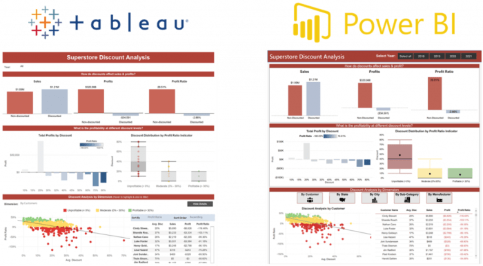
Visualization Capabilities
Both Power BI and Tableau offer a wide range of visualization options to help users create compelling and insightful data stories. They provide a variety of chart types, customization options, and tools for building interactive dashboards. Let’s delve deeper into their visualization capabilities and how they cater to different data storytelling needs.
Chart Types and Customization
Power BI and Tableau provide a comprehensive set of chart types, each designed to effectively represent different data patterns and relationships.
- Power BIoffers a wide array of chart types, including bar charts, line charts, pie charts, scatter plots, maps, and more. It also provides advanced visualizations like waterfall charts, funnel charts, and treemaps, which are useful for showcasing complex data trends.
- Tableau, similarly, boasts a diverse collection of chart types, including the standard ones like bar charts, line charts, and scatter plots. Tableau excels in its ability to create visually appealing and interactive visualizations, such as geographic maps, heatmaps, and packed bubble charts.
Choosing between Power BI and Tableau is like picking your favorite clay: both offer unique strengths. While Power BI might be a bit more versatile, Tableau is known for its user-friendly interface, making it a great choice for beginners.
But whether you’re a data wiz or a craft enthusiast, sometimes a break is needed. For a creative outlet, check out this amazing list of 20 clay craft projects , and then dive back into the world of data visualization with your renewed energy!
Its intuitive drag-and-drop interface makes it easy to explore different chart types and customize their appearance.
In terms of customization, both Power BI and Tableau offer a plethora of options to tailor visualizations to specific data storytelling needs. Users can adjust colors, fonts, labels, and other visual elements to enhance clarity and impact.
Interactive Dashboards
Both Power BI and Tableau empower users to create interactive dashboards that allow users to explore data dynamically.
- Power BIdashboards are highly interactive, enabling users to drill down into data, filter visualizations, and highlight specific data points. Users can also create dynamic reports that automatically update based on changes in the underlying data.
- Tableaudashboards are known for their seamless interactivity. Users can create interactive filters, drill-down capabilities, and cross-filtering, allowing for a deeper exploration of data relationships. Tableau also offers advanced features like story points, which provide a guided tour through a series of visualizations, enhancing data storytelling.
Data Storytelling Examples
Both Power BI and Tableau can be used to create compelling data stories for a variety of purposes.
- Power BIcan be used to create a dashboard that tracks sales performance over time. Users can filter the data by region, product, or customer segment, allowing them to identify trends and opportunities. The dashboard could also include a map visualization that shows sales performance by geographic location.
- Tableaucan be used to create a dashboard that explores the relationship between customer demographics and purchasing behavior. Users can use interactive filters to see how different customer segments respond to different marketing campaigns. The dashboard could also include a scatter plot that shows the relationship between customer age and spending.
Collaboration and Sharing
Both Power BI and Tableau offer robust collaboration and sharing features, enabling organizations to foster data-driven decision making by facilitating teamwork and knowledge dissemination.
Team Collaboration
Power BI and Tableau provide distinct approaches to team collaboration, catering to diverse organizational needs.
- Power BI promotes collaborative workspaces, enabling teams to share data sources, reports, and dashboards, fostering a centralized environment for shared insights. Users can co-author reports, allowing multiple individuals to work on the same document simultaneously. Power BI also supports version control, allowing users to track changes and revert to previous versions if necessary.
This fosters transparency and ensures a unified understanding of data insights.
- Tableau’s collaborative capabilities revolve around workbooks, which can be shared among team members. While co-authoring is not directly supported, Tableau offers features like “Comments” and “Subscriptions,” enabling users to discuss data visualizations and receive regular updates on shared dashboards. This approach encourages communication and ensures timely access to relevant information.
Data Sharing
Both Power BI and Tableau offer various methods for data sharing, ensuring that insights reach the right audience.
- Power BI allows users to share reports and dashboards through different channels, including web embeds, email, and Power BI service. This ensures widespread accessibility, enabling users to access data visualizations from any device. Power BI also offers data sharing options for specific users or groups, allowing organizations to control data access and ensure security.
This controlled data sharing approach is particularly valuable for organizations with sensitive data or specific user roles.
- Tableau provides multiple options for data sharing, including embedding dashboards on websites or web pages, sharing reports through links, and publishing dashboards to Tableau Server. This flexibility enables organizations to tailor data sharing strategies to their specific needs. Tableau Server offers advanced security features, allowing organizations to define user roles and permissions, ensuring data is accessible only to authorized individuals.
Publishing Reports
Power BI and Tableau offer diverse options for publishing reports, ensuring that data insights are readily accessible and easily consumed.
- Power BI allows users to publish reports to the Power BI service, a cloud-based platform that provides a centralized repository for dashboards and reports. This approach facilitates easy access and sharing of reports across the organization. Power BI also allows users to publish reports to specific workspaces, ensuring that data insights are shared with the relevant teams.
This targeted approach promotes effective communication and ensures that information reaches the intended audience.
- Tableau enables users to publish reports to Tableau Server, a platform that provides a central location for managing and sharing dashboards and reports. This approach allows organizations to control access to data insights, ensuring that information is shared with the appropriate users.
Tableau Server also offers features like scheduled refreshes, ensuring that data visualizations are updated automatically, providing users with the latest insights. This automated approach ensures that data is always current and relevant, supporting informed decision-making.
Pricing and Licensing
The cost of using Power BI and Tableau is an important factor for organizations considering adopting either tool. Both platforms offer different pricing models and licensing options, each with its own advantages and disadvantages.
Power BI Pricing
Power BI offers a tiered pricing structure, making it suitable for a wide range of organizations. The pricing model caters to both individuals and enterprises, with different features and capabilities depending on the plan chosen.
- Power BI Desktop:This free version provides access to the core data visualization and analysis features, allowing users to create interactive reports and dashboards. It is ideal for individual users or small teams who want to explore data visualization capabilities without any upfront cost.
However, it lacks features like data sharing and collaboration, which are available in paid plans.
- Power BI Pro:This paid plan offers a more comprehensive set of features, including data sharing, collaboration, and advanced analytics. It is suitable for individuals and teams who require more robust capabilities for data visualization and analysis. The cost is $10 per user per month, which provides access to a wider range of features, including the ability to publish reports and dashboards to the Power BI service, enabling sharing and collaboration.
- Power BI Premium:This plan caters to enterprises with more complex data analysis and visualization needs. It offers features like advanced analytics, data governance, and enterprise-grade scalability. The cost is based on the number of users and the capacity required, making it suitable for large organizations with extensive data analysis requirements.
Power BI Premium offers a dedicated capacity, providing a more controlled and secure environment for data visualization and analysis. This plan is ideal for organizations that require a high level of security and performance for their data visualization solutions.
Tableau Pricing
Tableau offers a similar tiered pricing structure to Power BI, catering to individuals, teams, and enterprises. The pricing model emphasizes user-based licensing, with different tiers offering varying features and capabilities.
- Tableau Public:This free version allows users to create and share interactive visualizations, but it is limited to publicly accessible data. This option is suitable for individuals and teams who want to explore Tableau’s capabilities and share their work with a broader audience.
However, it lacks features like data connectivity, collaboration, and the ability to connect to private data sources.
- Tableau Creator:This paid plan offers a comprehensive set of features, including data connectivity, collaboration, and advanced analytics. It is suitable for individuals and teams who require more robust capabilities for data visualization and analysis. The cost is $70 per user per month, providing access to a wide range of features, including the ability to connect to various data sources, create interactive dashboards, and share their work with others.
- Tableau Explorer:This plan offers a more limited set of features compared to Creator, focusing on data exploration and visualization. It is suitable for users who primarily consume data visualizations and dashboards created by others. The cost is $35 per user per month, making it a more affordable option for organizations that need to provide access to data visualization tools to a larger number of users.
- Tableau Server:This plan offers a dedicated server for hosting Tableau content, enabling organizations to manage and share data visualizations within their own environment. It is suitable for enterprises that require a high level of security and control over their data visualization solutions.
The cost is based on the number of users and the server capacity required, making it a scalable solution for large organizations with complex data visualization needs.
Cost Implications
The cost of adopting Power BI or Tableau depends on several factors, including the number of users, the required features, and the level of support needed. For small organizations with limited data analysis needs, the free versions of both platforms might be sufficient.
However, as the organization grows and its data analysis needs become more complex, a paid plan may be required.Organizations considering adopting either tool should carefully evaluate their needs and budget to determine the best option.
It is important to note that the pricing models and licensing options of both platforms can be complex, and it is recommended to consult with a vendor representative for a detailed analysis of the best plan for your organization’s needs.