
Google Data Studio Guide: Your Data Visualization Journey
Google Data Studio Guide: This guide is your key to unlocking the power of data visualization with Google Data Studio. It’s not just about creating pretty charts; it’s about turning raw data into actionable insights. Whether you’re a seasoned data analyst or just starting out, this guide will empower you to build compelling dashboards and reports that tell a compelling story with your data.
Imagine transforming a sea of numbers into clear, engaging visuals that highlight trends, patterns, and opportunities. Google Data Studio is your tool for doing just that. From connecting to various data sources to creating interactive reports, this guide will walk you through every step of the process, ensuring you master the art of data visualization.
Introduction to Google Data Studio

Google Data Studio is a free data visualization tool that allows you to create interactive reports and dashboards from your data. You can connect to various data sources, such as Google Analytics, Google Sheets, and BigQuery, and create custom reports that are tailored to your specific needs.
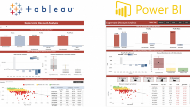
Data Studio offers a user-friendly interface and drag-and-drop functionality, making it easy for anyone to create visually appealing reports. It provides a wide range of visualization options, such as charts, graphs, tables, and maps, allowing you to present your data in a way that is both informative and engaging.
Benefits of Using Google Data Studio
Data Studio offers several benefits, making it a valuable tool for businesses and individuals alike.
- Easy to Use:Data Studio’s intuitive interface and drag-and-drop functionality make it easy to create reports, even for users with limited technical skills.
- Free to Use:Google Data Studio is a free tool, making it accessible to businesses and individuals of all sizes.
- Interactive Reports:Data Studio allows you to create interactive reports that users can explore and filter, providing deeper insights into the data.
- Wide Range of Data Sources:Data Studio supports a wide range of data sources, including Google Analytics, Google Sheets, BigQuery, and more.
- Collaboration Features:Data Studio allows you to collaborate with others on reports and dashboards, making it easy to share insights and work together on projects.
- Customizable Reports:You can customize the look and feel of your reports to match your brand and preferences.
- Data Visualization Options:Data Studio offers a wide range of visualization options, such as charts, graphs, tables, and maps, allowing you to present your data in a way that is both informative and engaging.
Examples of How Google Data Studio Can Be Used in Various Industries
Data Studio can be used in various industries to gain insights from data and make informed decisions. Here are a few examples:
- Marketing:Marketers can use Data Studio to track campaign performance, analyze website traffic, and identify trends in customer behavior. They can also use it to create interactive dashboards that provide a comprehensive overview of their marketing efforts.
- Sales:Sales teams can use Data Studio to track sales performance, identify top-performing products, and analyze customer demographics. They can also use it to create dashboards that show sales trends and forecast future revenue.
- Finance:Finance professionals can use Data Studio to track financial performance, analyze spending patterns, and identify areas for improvement. They can also use it to create dashboards that show key financial metrics and trends.
- Human Resources:HR teams can use Data Studio to track employee engagement, analyze turnover rates, and identify training needs. They can also use it to create dashboards that show key HR metrics and trends.
- Healthcare:Healthcare organizations can use Data Studio to track patient outcomes, analyze patient demographics, and identify areas for improvement in patient care. They can also use it to create dashboards that show key healthcare metrics and trends.
Getting Started with Google Data Studio

Google Data Studio is a free, powerful tool that helps you visualize and analyze data from various sources. It’s a user-friendly platform that requires no coding knowledge, making it accessible to users of all skill levels. With Data Studio, you can create interactive dashboards and reports that provide valuable insights into your data.
Creating a New Google Data Studio Report
To start creating reports, you need to create a new report. This is a straightforward process:
- Log in to your Google Data Studio account.
- Click on the “Create” button in the top-left corner.
- Select “Report” from the options.
You will then be presented with a blank report canvas, ready for you to start adding data and visualizations.
Connecting to Data Sources
Connecting to your data is the next step. Data Studio offers a wide range of data sources, including Google Analytics, Google Sheets, BigQuery, and many more. To connect a data source:
- Click on the “Add a data source” button in the left sidebar.
- Select the type of data source you want to connect to.
- Follow the instructions to authenticate and connect to your data.
Once connected, your data will be available in Data Studio, ready for analysis and visualization.
Exploring the Data Studio Interface
The Data Studio interface is intuitive and designed to be user-friendly. The main components of the interface include:
- Report Canvas:This is the central area where you create and edit your report. You can add charts, tables, text boxes, and other elements here.
- Data Source Panel:This panel displays the connected data sources and allows you to select the data you want to use in your report.
- Explorer Panel:This panel helps you explore and understand your data. You can view data tables, filter data, and create custom dimensions and metrics.
- Chart Gallery:This panel provides a variety of charts and visualizations you can use to present your data effectively.
Data Blending
Data blending is a powerful feature in Data Studio that allows you to combine data from multiple sources. This is useful when you need to analyze data from different systems or perspectives. For example, you could blend data from Google Analytics with data from your CRM system to gain a more comprehensive view of your customer interactions.
- Benefits of Data Blending:
- Combined Insights:You can create reports that combine data from different sources, providing a holistic view of your data.
- Enhanced Analysis:Data blending allows you to analyze relationships between data from different sources, leading to deeper insights.
- Reduced Data Silos:By combining data from multiple sources, you can break down data silos and improve data accessibility.
Data Exploration and Analysis
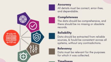
Data exploration and analysis are crucial steps in extracting meaningful insights from your data in Google Data Studio. These processes allow you to delve deeper into your data, uncover hidden patterns, and identify key trends that can inform your decision-making.
I’m currently diving deep into the world of Google Data Studio, learning how to visualize data in engaging ways. It’s amazing how you can turn raw numbers into compelling stories, and I’m really enjoying the process! I even found some inspiration in this article about Harvey Nichols’ five beauty picks chosen by industry insiders , which highlights the power of data-driven insights in the beauty industry.
Back to my Google Data Studio journey, I’m excited to explore more advanced features and see what creative dashboards I can build!
Filtering and Segmenting Data
Filtering and segmenting data are essential for focusing your analysis on specific aspects of your data. Filtering allows you to isolate specific data points based on certain criteria, while segmentation divides your data into groups based on shared characteristics.
- Filters: Filters are applied to individual data sources or reports, allowing you to narrow down the data displayed. You can use filters to show only data for a particular time period, region, or customer segment. For example, you might filter a sales report to view only sales data for the last quarter.
- Segments: Segments allow you to create custom groupings of your data based on specific criteria. This can be useful for analyzing data across different customer segments, product categories, or geographic regions. For instance, you might segment your customer base into loyal customers, new customers, and lapsed customers to understand their purchasing behavior.
Check out this guide on diy paneled ceiling how to cover popcorn ceilings to get started. Once your ceiling is looking sharp, you can focus on creating impactful data stories with Google Data Studio!
3>Data Analysis Techniques
Google Data Studio offers a range of built-in analysis techniques that can be applied to your data. These techniques allow you to explore your data from various perspectives and uncover valuable insights.
- Trend Analysis: Trend analysis helps you identify patterns and changes in your data over time. This can be useful for understanding the growth or decline of key metrics, identifying seasonal trends, or predicting future performance. You can create line charts, area charts, and other time-series visualizations to explore trends in your data.
Google Data Studio is a powerful tool for visualizing data, and it can be particularly useful for tracking the progress of projects. If you’re using a Scrum Agile framework, you’ll want to make sure your data is organized and easily accessible.
Check out this comprehensive guide on scrum agile project management for the smart person to get a better understanding of how to integrate these methodologies. Once you’ve got your data in order, you can use Google Data Studio to create dashboards that provide a clear picture of your project’s progress and identify any potential roadblocks.
- Comparative Analysis: Comparative analysis involves comparing different data sets or segments to identify differences and similarities. This can be useful for benchmarking performance, understanding market share, or identifying areas for improvement. Bar charts, pie charts, and stacked charts are commonly used for comparative analysis.
- Correlation Analysis: Correlation analysis examines the relationship between different data points to understand how they influence each other. This can be helpful for identifying key drivers of performance, understanding customer behavior, or optimizing marketing campaigns. Scatter plots and correlation matrices are used to visualize correlations between data points.
Calculated Fields
Calculated fields allow you to create new data fields based on existing data. This enables you to perform advanced calculations, derive new metrics, and customize your analysis.
Calculated fields are defined using a formula language similar to spreadsheet software.
- Example: Imagine you want to calculate the average order value (AOV) for your online store. You can create a calculated field named “AOV” with the formula:
SUM(Revenue) / COUNT(Orders). This formula calculates the total revenue divided by the number of orders, providing you with the average order value.
Data Storytelling
Data storytelling involves presenting your data insights in a clear, concise, and engaging way to communicate effectively with your audience. This involves selecting the right visualizations, using clear and concise language, and structuring your narrative to guide your audience through your findings.
- Visualizations: Select visualizations that best represent your data and communicate your insights clearly. Bar charts are effective for comparing data across categories, while line charts are suitable for showcasing trends over time. Consider using different chart types to create a visually appealing and informative report.
- Narrative Structure: Structure your report with a clear beginning, middle, and end. Start with an introduction that sets the context for your analysis and highlights the key questions you are trying to answer. Then, present your findings using visualizations and clear explanations.
Finally, conclude with a summary of your key insights and recommendations for action.
Collaboration and Sharing Reports: Google Data Studio Guide
Google Data Studio provides powerful features for collaboration and sharing reports, allowing you to work with others on data visualizations and share insights with your team or a wider audience. You can easily control who can view, edit, and even manage your reports, ensuring data security and fostering effective collaboration.
Setting Permissions
You can control who can access and edit your reports by setting permissions. This is crucial for maintaining data integrity and ensuring only authorized individuals can make changes. * You can set permissions for individual users or groups.
- You can grant different levels of access, including view-only, edit, and manage permissions.
- View-only permissions allow users to see the report but not make any changes.
- Edit permissions allow users to make changes to the report, including adding data sources, creating charts, and editing visualizations.
- Manage permissions give users full control over the report, including the ability to share it with others and set permissions.
- You can set permissions from the “Share” button in the top right corner of your report.
Embedding Reports
You can embed Data Studio reports directly into websites, blogs, and other platforms. This allows you to seamlessly integrate data visualizations into your existing content, making it easier for your audience to access and understand the information.* To embed a report, you can use the “Embed” option in the “Share” menu.
- Data Studio provides an iframe code that you can copy and paste into your website’s HTML.
- You can customize the size and appearance of the embedded report to fit your website’s design.
Sharing Strategies
Effective report sharing strategies can help ensure your reports are seen and understood by the right people. * Target your audience:Consider who needs to see the report and tailor your sharing strategy accordingly.
Use clear and concise titles
A descriptive title helps people understand the purpose of the report.
Provide context
Include a brief introduction or summary to explain the key findings of the report.
Highlight key insights
Use annotations, charts, and other visualizations to draw attention to the most important information.
Encourage feedback
Make it easy for people to provide feedback on the report, either through comments or a dedicated feedback form.
Advanced Features and Techniques
Google Data Studio offers a range of advanced features that enable you to perform sophisticated data analysis and create dynamic, interactive reports. This section delves into these capabilities, showcasing how they empower you to gain deeper insights from your data.
Custom Connectors and Data Blending
Custom connectors and data blending are powerful tools for combining data from various sources within Google Data Studio. They allow you to create a unified view of your data, enabling comprehensive analysis and reporting.
- Custom Connectors:These connectors allow you to connect to data sources not natively supported by Google Data Studio. You can create custom connectors using the Google Data Studio API or by leveraging pre-built connectors from the community. This opens up possibilities for connecting to databases, APIs, and other data sources.
For example, you can create a custom connector to access data from a CRM system, a marketing automation platform, or a custom database.
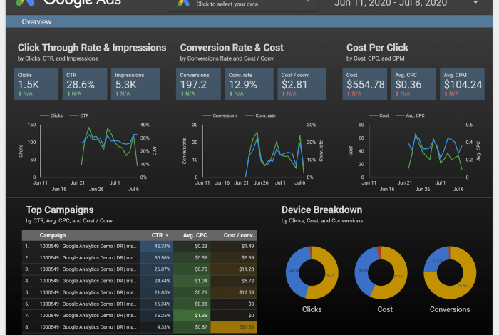
- Data Blending:This feature allows you to combine data from multiple data sources within a single report. You can join data based on common fields, enabling you to analyze relationships and trends across different datasets. For example, you can blend data from Google Analytics and Google Ads to understand how website traffic translates into conversions.
Data blending helps you create a holistic view of your data, revealing insights that might be hidden when analyzing data sources in isolation.
Interactive Reports
Google Data Studio enables you to create interactive reports that engage your audience and provide a dynamic data exploration experience.
- Filters and Slicers:These interactive elements allow users to filter and segment data in real-time. Users can select specific values, ranges, or conditions to explore different aspects of the data, leading to more personalized and insightful analysis. For example, a marketing team might use filters to analyze website traffic by specific campaigns or demographics.
- Drill-down Functionality:Interactive reports can be designed to allow users to drill down into data at different levels of detail. This provides a granular view of data, enabling users to investigate specific trends or anomalies. For instance, a financial analyst might drill down into a sales report to examine individual transactions or product performance.
- Data Visualization:Google Data Studio offers a wide range of visualization options, including charts, graphs, maps, and tables. These visualizations can be made interactive, allowing users to explore the data in different ways. For example, a sales manager might use an interactive bar chart to compare sales performance across different regions, then drill down to examine individual sales representatives within a specific region.
Data Governance and Security
Google Data Studio provides features to ensure data governance and security, safeguarding your data and maintaining compliance with industry standards.
- Data Access Control:You can control who has access to your reports and data sources. This includes setting permissions for viewing, editing, and sharing reports. You can also create specific roles and permissions for different users, ensuring data access is restricted to authorized individuals.
- Data Encryption:Google Data Studio uses industry-standard encryption to protect your data both in transit and at rest. This helps to prevent unauthorized access and data breaches.
- Data Audit Trail:Google Data Studio maintains an audit trail of all data access and modifications. This helps to track data usage, identify potential security issues, and ensure compliance with data governance policies.
Use Cases, Google data studio guide
Google Data Studio can be used for a wide range of use cases, including:
- Marketing Analytics:Track website traffic, campaign performance, social media engagement, and customer behavior. Use data blending to connect data from different marketing channels and gain a comprehensive view of your marketing efforts.
- Financial Reporting:Create financial dashboards, track key performance indicators (KPIs), analyze budgets, and generate reports for stakeholders. Leverage data blending to combine financial data with operational data for a holistic view of business performance.
- Website Performance Analysis:Monitor website traffic, page views, bounce rates, and user behavior. Use interactive reports to identify areas for improvement and optimize website performance. Analyze data from Google Analytics, Search Console, and other web analytics tools to gain a comprehensive understanding of website performance.