
What is Data Visualization: Turning Data into Insights
What is data visualization? It’s the art and science of transforming raw data into compelling visuals that tell a story, reveal hidden patterns, and make complex information understandable. Imagine a sea of numbers, a labyrinth of spreadsheets, and the struggle to extract meaning from it all.
Data visualization is the compass that guides us through this maze, turning abstract data into a clear and insightful narrative.
Think about it: from weather maps predicting storms to financial charts revealing market trends, data visualization is everywhere, silently shaping our understanding of the world. It’s the tool that empowers us to make informed decisions, solve problems, and uncover hidden truths within data.
Introduction to Data Visualization: What Is Data Visualization

Data visualization is the process of transforming data into visual representations, such as charts, graphs, and maps, to reveal patterns, trends, and insights. It’s a powerful tool for understanding complex information and communicating findings effectively.Data visualization is essential in various fields, including:
Applications of Data Visualization
Data visualization plays a crucial role in diverse fields, enabling better understanding and decision-making. Here are some examples:
- Business:Businesses use data visualization to track sales performance, analyze customer behavior, and identify market trends. For example, a company might use a bar chart to compare sales figures across different product lines or a line chart to track revenue growth over time.
- Healthcare:Data visualization helps healthcare professionals monitor patient health, identify disease outbreaks, and analyze treatment outcomes. For instance, a doctor might use a scatter plot to visualize the relationship between blood pressure and cholesterol levels in patients with heart disease.
- Science:Scientists use data visualization to analyze research data, visualize complex scientific models, and communicate findings to the scientific community. For example, a climate scientist might use a heat map to visualize global temperature changes over time.
- Finance:Financial analysts use data visualization to track stock prices, analyze market trends, and manage investment portfolios. For example, a financial analyst might use a candlestick chart to visualize the price history of a particular stock.
- Government:Governments use data visualization to track economic indicators, analyze social trends, and plan public policy. For example, a government agency might use a pie chart to visualize the distribution of government spending across different sectors.
Importance of Conveying Insights
The primary objective of data visualization is to convey insights and facilitate understanding. Visual representations can effectively communicate complex information, making it easier to grasp patterns, trends, and relationships that might be difficult to discern from raw data alone.
“A picture is worth a thousand words,”
This proverb aptly captures the essence of data visualization. By transforming data into visual formats, we can communicate insights more effectively, leading to better decision-making and a deeper understanding of the underlying data.
Data visualization is the art of transforming complex data into easily understandable visual representations. It’s like turning a jumbled mess of numbers into a captivating story. And just like learning a new language can open up a world of possibilities, understanding how to quickly translate webpages on your iPhone or iPad using Safari can be incredibly helpful, especially when you’re exploring data from different sources.
This article provides a step-by-step guide to make your web browsing experience more efficient and accessible. Ultimately, whether it’s analyzing data or navigating the internet, the key is to find tools and techniques that help you see the bigger picture and make informed decisions.
Key Elements of Data Visualization
Data visualization is the process of using visual representations to explore, analyze, and communicate data. It’s like translating raw data into a language that’s easily understood by the human brain. By transforming numbers into charts, graphs, and maps, we can uncover patterns, trends, and insights that might be missed when looking at data in its raw form.
But to create effective visualizations, we need to understand the key elements that contribute to their success.
Data visualization is all about taking complex information and turning it into something easy to understand, like a chart or graph. It’s super helpful for making sense of trends, like the one in Canada’s high-yield bond market, which is booming right now.
By visualizing this data, investors can quickly grasp the market’s current state and make informed decisions.
Data
The foundation of any data visualization is the data itself. The quality and relevance of the data directly impact the insights you can derive. Before visualizing, it’s essential to ensure your data is accurate, clean, and relevant to the story you want to tell.
Chart Type
The chart type you choose plays a crucial role in how your data is presented. Different chart types are suited for different types of data and storytelling purposes. For example, a bar chart is ideal for comparing categories, while a line chart is better for showing trends over time.
Axes
Axes provide context and scale to your data. The x-axis typically represents the independent variable, while the y-axis represents the dependent variable. Clearly labeled axes help viewers understand the relationships between data points.
Labels
Labels are essential for providing clarity and context to your visualization. They identify the data points, categories, and units of measurement. Clear and concise labels make your visualization more accessible and understandable.
Data visualization is all about making sense of complex data through visual representations, like charts and graphs. It’s a powerful tool for understanding trends, patterns, and insights that might be hidden within raw data. Imagine, for example, the possibilities of using data visualization to track the movement of a mobile robot, like the one Apple is reportedly developing apple is developing a product even more adventurous than apple vision pro company explores a mobile robot that can follow users around their homes.
Data visualization could help us understand how the robot navigates, interacts with its environment, and even learns over time.
Legends
Legends explain the different symbols, colors, or patterns used in your visualization. They help viewers differentiate between data sets and understand the meaning of different visual elements.
Visual Design
Visual design principles play a crucial role in making data visualizations effective and engaging. Here are some key aspects:
Color
Color is a powerful tool for highlighting key data points, differentiating between categories, and guiding the viewer’s attention. Choose a color palette that is both visually appealing and conveys the intended message.
Shape
Shapes can be used to represent different categories or data points. Use shapes that are easily distinguishable and don’t distract from the overall message.
Size
Size can be used to represent the magnitude of data points. Larger sizes can indicate higher values, while smaller sizes can indicate lower values.
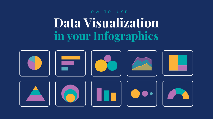
Types of Data Visualizations

Data visualization encompasses a wide array of chart types, each tailored to present different aspects of data effectively. Understanding these types is crucial for choosing the right visualization for your specific data and insights.
Common Data Visualization Types
This section presents a comprehensive table outlining common data visualization types, their characteristics, suitable data types, and illustrative examples.
| Chart Type | Description | Data Types | Examples |
|---|---|---|---|
| Bar Chart | Displays categorical data using bars of varying heights or lengths, representing the magnitude of each category. | Categorical data, numerical data | Sales by product category, customer demographics |
| Line Chart | Connects data points with lines to show trends and patterns over time or a continuous variable. | Time series data, continuous data | Stock price fluctuations, website traffic over time |
| Pie Chart | Represents proportions of a whole using slices of a circle, where the size of each slice corresponds to its proportion. | Categorical data, proportions | Market share of different brands, age distribution in a population |
| Scatter Plot | Plots individual data points on a two-dimensional plane, showing relationships between two variables. | Numerical data | Correlation between height and weight, relationship between income and education level |
| Histogram | Groups data into ranges and displays the frequency of each range using bars. | Numerical data | Distribution of ages in a sample, frequency of customer purchases |
| Heatmap | Uses color gradients to represent data values in a matrix, highlighting areas of high or low values. | Numerical data, categorical data | Customer churn rate by region, website traffic by page |
| Treemap | Displays hierarchical data using nested rectangles, where the area of each rectangle represents its value. | Hierarchical data, numerical data | File system structure, sales by product category and sub-category |
| Network Graph | Represents relationships between entities using nodes and edges, where nodes represent entities and edges represent connections. | Network data, relational data | Social network connections, website links |
| Map | Displays geographical data using a map, often overlaid with markers, lines, or areas to represent data points. | Geographical data, spatial data | Sales by location, distribution of population |
Strengths and Limitations of Chart Types
Each chart type has its strengths and limitations, making it suitable for specific data and purposes.
“Choosing the right visualization is crucial for conveying insights effectively.”
- Bar chartsare effective for comparing categorical data, but can become cluttered with many categories.
- Line chartsexcel at showing trends over time, but may not be suitable for comparing multiple datasets.
- Pie chartsare useful for representing proportions of a whole, but can be difficult to interpret with many categories.
- Scatter plotsare ideal for visualizing relationships between two variables, but may not be suitable for large datasets.
- Histogramsprovide insights into data distribution, but can be difficult to compare multiple distributions.
- Heatmapseffectively highlight areas of high or low values, but can be challenging to interpret for large datasets.
- Treemapsare effective for visualizing hierarchical data, but can be difficult to read with complex hierarchies.
- Network graphsare excellent for representing relationships between entities, but can be difficult to interpret with complex networks.
- Mapsare powerful for visualizing geographical data, but may require specialized software for complex visualizations.
Future Trends in Data Visualization
The field of data visualization is constantly evolving, driven by advancements in technology and the increasing volume and complexity of data. New trends are emerging that are transforming how we understand and interact with data, opening up exciting possibilities for innovation and problem-solving.
Interactive Dashboards
Interactive dashboards are becoming increasingly popular as a way to present data in a dynamic and engaging way. These dashboards allow users to explore data in real-time, filter data based on specific criteria, and drill down into details. This interactivity enhances data exploration and provides deeper insights.
For example, a business intelligence dashboard could allow users to analyze sales data by region, product category, or time period, providing insights into trends and performance.
Augmented Reality, What is data visualization
Augmented reality (AR) is another emerging technology that is poised to revolutionize data visualization. AR overlays digital information onto the real world, creating immersive experiences that can enhance data comprehension. Imagine visualizing complex data sets in a 3D environment, or using AR to overlay real-time data onto physical objects.
This technology has the potential to transform fields such as manufacturing, healthcare, and education, by providing more intuitive and engaging ways to interact with data.
Data Storytelling
As the volume of data continues to grow, it becomes increasingly important to communicate data effectively. Data storytelling is a powerful technique that uses data visualization to create compelling narratives that resonate with audiences. By combining data with engaging visuals and narratives, data storytelling can make complex data accessible and understandable to a wider audience.
For example, a data story could illustrate the impact of climate change on sea levels, using charts and maps to visualize trends over time.
Artificial Intelligence
Artificial intelligence (AI) is playing an increasingly important role in data visualization, automating tasks such as data cleaning, feature extraction, and visualization selection. AI-powered tools can analyze large datasets and identify patterns that might be missed by human analysts. AI can also be used to create interactive visualizations that adapt to user preferences and provide personalized insights.
Data Visualization for Social Good
Data visualization is becoming increasingly important in addressing complex social challenges. Data can be used to raise awareness about issues such as poverty, inequality, and climate change. Data visualization tools can be used to communicate data in a clear and compelling way, inspiring action and promoting positive change.
For example, visualizations can be used to highlight the impact of climate change on vulnerable communities, or to showcase the effectiveness of social programs.
Ethical Considerations
As data visualization becomes more powerful and pervasive, it is important to consider the ethical implications of its use. Data visualization can be used to manipulate or mislead audiences, so it is important to ensure that visualizations are accurate, transparent, and unbiased.
It is also important to consider the privacy and security of data, and to ensure that data is not used in a way that could harm individuals or communities.