Google brings Liquid Glass design language to iOS apps to bridge the aesthetic gap between platforms

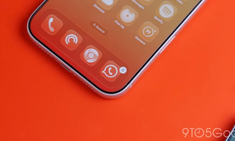
As Google marks the first anniversary of its "Liquid Glass" design framework, the company has begun a significant visual rollout across its suite of iOS applications. This update, which integrates the translucent aesthetic alongside the broader Material 3 Expressive design language, represents a strategic move to harmonize the Google user experience on Apple hardware while acknowledging the unique UI paradigms of the iOS ecosystem. The most prominent implementation of this update is found in the latest iteration of Google Photos, version 7.94, which replaces the previously static, opaque bottom navigation bars with the new, sophisticated Liquid Glass interface.
The Evolution of Google’s Design Language on iOS
The journey toward this visual shift began in earnest with the introduction of Material You, and subsequently, Material 3, which prioritized personalization and fluid interactions on Android. However, translating these concepts to iOS has historically been a challenge for Google designers. Unlike Android, where system-level hooks allow for deep integration of dynamic color palettes and fluid transitions, iOS imposes a more rigid design framework.
For years, Google apps on iOS functioned as a hybrid of Google’s internal design language and Apple’s Human Interface Guidelines. The previous Google Material Theme, which favored solid backgrounds and high-contrast, opaque elements, was the standard for years. By late 2024 and early 2025, it became increasingly clear that this aesthetic was beginning to look dated compared to the sleek, semi-transparent overlays common in native Apple apps and the modern web.
The introduction of "Liquid Glass" as a design concept—first unveiled roughly twelve months ago—was intended to address this by providing a sense of depth and environmental awareness. By allowing the content underneath a navigation element to blur and bleed through, the interface feels more dynamic and integrated with the underlying media, particularly in photo-heavy applications.
Technical Implementation and User Experience
In Google Photos version 7.94, the transformation of the floating bottom bar is immediate and striking. Users now have access to customizable translucency settings. The "Default" setting provides a subtle hint of the image content beneath the navigation bar, creating a soft, layered effect. The "More clear" option takes this further, allowing for a more aggressive transparency that effectively merges the navigation controls with the scrollable photo gallery.
Under dark mode, the implementation is particularly nuanced. The translucent material interacts with the accent colors of the UI, specifically the current tab indicator, which now adopts a subtle blue tint that filters through the blurred background. This adds a layer of depth that was absent in the older, flat design. Furthermore, Google has extended this treatment to the top navigation bars, updating buttons and control elements to match the frosted glass aesthetic.
![Google combines Material 3 Expressive & Liquid Glass on the iPhone [Gallery]](https://9to5google.com/wp-content/uploads/sites/4/2026/03/Liquid-Glass-dock-on-iPhone-17-Pro-Max.jpg?quality=82&strip=all&w=1600)
The application of Liquid Glass is not limited to Photos. Google Health has also received a comprehensive design overhaul. The navigation bars within the app now mirror the translucent behavior seen in Photos, while the "Ask Coach" floating action button (FAB) has been updated with a frosted treatment. This creates a cohesive look across the app, ensuring that the interface elements do not feel disconnected from the health data displayed on the screen.
The Material 3 Transition Strategy
This rollout is part of a larger, multi-year project to phase out the legacy Google Material Theme in favor of Material 3 (M3) across all Apple-bound software. The transition has been uneven, with some apps like Google Tasks receiving updates relatively early in the cycle, while productivity suites like Google Docs, Sheets, Slides, and Keep have lagged behind.
The delay in these productivity apps is largely attributed to the complexity of their interfaces. Unlike a media-centric app like Photos, Docs and Sheets require high-density information display, where excessive transparency can interfere with readability. Google’s design teams have had to carefully balance the "Expressive" nature of Material 3 with the functional necessity of a clean, distraction-free document editing environment. The recent push suggests that Google has finally reached a internal consensus on how to apply Liquid Glass in a way that prioritizes utility without sacrificing the aesthetic benefits of the new design language.
Analyzing the Absence of Dynamic Color on iOS
A recurring question regarding Google’s design strategy on iOS is the absence of "Dynamic Color"—the feature that allows Android apps to extract colors from a user’s wallpaper and apply them across the system. While users have often requested this functionality for their iPhones, technical and structural limitations make a full implementation unlikely.
From a design and engineering perspective, Google’s iOS apps run within the "sandbox" of the iOS operating system. Apple does not provide third-party applications with the same level of access to system-wide wallpaper data that is available in the Android Open Source Project (AOSP). For Google to implement Dynamic Color, it would have to develop a custom, manual system where users select an accent color within the app settings.
However, internal analysis suggests that such a feature might be considered "pointless" by the design team. Without a direct link to the user’s system wallpaper, a manual color picker would not provide the "magical", automated experience that defines Dynamic Color on Android. Instead, Google has opted to lean into the translucent, neutral, and high-quality "Liquid Glass" aesthetic, which complements Apple’s native design choices rather than attempting to force an Android-centric paradigm onto a platform that does not support it.
Broader Implications and Industry Context
The adoption of Liquid Glass across iOS signifies that Google is no longer treating its Apple-platform apps as second-class citizens or mere ports of Android software. By embracing the translucent design trends that are popular in current software design—such as Apple’s own glass-morphism in iOS and iPadOS—Google is positioning its apps to feel "at home" on an iPhone while maintaining a distinct, recognizable Google identity.
![Google combines Material 3 Expressive & Liquid Glass on the iPhone [Gallery]](https://9to5google.com/wp-content/themes/ninetofive/dist/images/google-preferred-source-badge-dark.png)
From a branding standpoint, this is a vital maneuver. If Google’s apps felt too alien to the iOS ecosystem, user retention could suffer as competitors offer more integrated experiences. Conversely, if Google apps were indistinguishable from Apple’s native apps, the company would lose its unique brand recognition. The Liquid Glass implementation strikes a balance: it feels modern and fits the visual language of the iPhone, but the specific implementation of the Material 3 Expressive elements reminds users that they are operating within the Google ecosystem.
Future Outlook
As the company continues to iterate on its design language, industry observers expect the Liquid Glass aesthetic to propagate to the remaining Google apps that have not yet been updated. The priority, according to the current release cadence, appears to be focused on high-usage apps first, followed by the productivity suite.
The consistency that Material 3 and Liquid Glass bring to the table is expected to reduce the cognitive load for users who switch between Android and iOS devices. While the platforms remain distinct, the visual continuity provided by these updates ensures that a user’s muscle memory and expectations for interface behavior remain relatively stable regardless of the hardware in their hand.
As of early 2026, the transition is approximately 70% complete across the core Google iOS portfolio. The final phase of this transition will likely involve refining the motion design—the way these translucent elements animate when a user scrolls or transitions between tabs. As the "Expressive" component of Material 3 matures, users can expect more fluid, physics-based animations that accompany the visual changes brought by Liquid Glass.
Ultimately, this design shift serves as a testament to Google’s evolving philosophy regarding multi-platform development. By focusing on design frameworks that are flexible enough to respect the constraints of different operating systems while retaining a unified brand identity, Google is successfully navigating the challenges of modern software design in a fragmented hardware market. As more updates reach the App Store in the coming months, the cohesive vision of a "Google-designed" experience on iOS will likely become the new standard for the company’s mobile presence.