Stop Making Shoppers Think: How Cognitive Friction Is Killing Your Conversion Rates


The foundational text of modern user-interface design, Steve Krug’s seminal work Don’t Make Me Think, remains the gold standard for understanding digital consumer behavior. Krug’s central thesis posits that every moment a user spends deciphering an interface is a moment stolen from the decision to purchase. When a shopper encounters ambiguity—whether it is a vague call to action or a confusing pricing structure—the cognitive load increases, leading to hesitation, frustration, and ultimately, cart abandonment.
In the contemporary e-commerce landscape, this psychological principle is more relevant than ever. Data from the Baymard Institute indicates that the average documented online shopping cart abandonment rate hovers around 70%. While shipping costs and account creation requirements are often cited as primary culprits, a significant, less-quantified driver of this abandonment is "cognitive friction"—the mental energy required to navigate a site’s logical architecture. By eliminating the need for customers to perform mental calculations, brands can significantly reduce the "reservoir of goodwill" that is inevitably depleted during a complex shopping experience.

The Psychology of Cognitive Load in E-commerce
Cognitive load theory, as applied to web design, suggests that users have a finite amount of working memory. When a website requires a user to calculate unit prices, convert measurements, or decipher obscure product naming conventions, it consumes that limited capacity. According to Nielsen Norman Group research, users do not read websites; they scan them. If the information is not immediately intuitive, the user does not pause to analyze; they exit.
This phenomenon is essentially a form of "decision fatigue." When presented with complex, non-standardized choices, the brain seeks the path of least resistance. In the context of e-commerce, that path is often the "back" button. Retailers that proactively remove these barriers do not just improve user experience (UX); they increase their bottom line by shortening the time-to-conversion.
Chronology of Interface Evolution
The shift toward simplified, intuitive design has evolved alongside the maturation of the mobile web. In the early 2000s, e-commerce sites were desktop-first, often mirroring physical catalogs with complex grids and dense text. As mobile penetration surged between 2010 and 2020, the constraints of smaller screens forced a "less is more" approach.

- 2010–2014: The rise of responsive design. Brands began stripping away non-essential elements to ensure sites functioned on various screen sizes.
- 2015–2019: The "minimalist era." Influenced by platforms like Amazon and Shopify, retailers adopted standardized navigation patterns, reducing the "Where do I click?" anxiety.
- 2020–Present: The "contextual clarity era." Leaders in the direct-to-consumer (DTC) space began moving beyond mere responsive design toward predictive interfaces that answer "What does this mean?" before the user even asks.
Case Studies in Eliminating Mental Math
Several innovative brands have recently overhauled their product pages to remove the need for arithmetic, demonstrating that clarity often dictates conversion.
Redefining Pack Sizes through Occasion-Based Marketing
Gush, a beverage retailer, has moved away from traditional quantity-based descriptors (e.g., "12-pack" or "24-pack") in favor of lifestyle-centric labeling. By using descriptors such as "With a Friend," "With the Crew," and "For the Party," the brand bypasses the shopper’s need to calculate how many units they require for a specific event. This creates a bridge between the product and the user’s intent, turning a mathematical decision into a social one.
Precision in Quantity and Unit Definitions
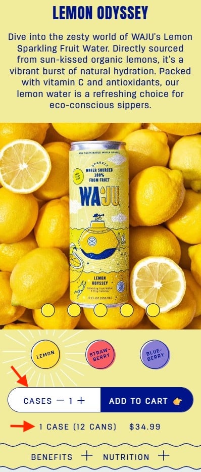
Waju provides a masterclass in transparency regarding bulk ordering. A common point of friction in beverage e-commerce is the confusion between individual units and case quantities. Waju addresses this by explicitly stating the case-to-can ratio directly beneath the quantity selector. By using a high-contrast design for the quantity field, they ensure that the user is never left wondering whether they are ordering a single item or a bulk shipment.
Outcome-Oriented Product Naming
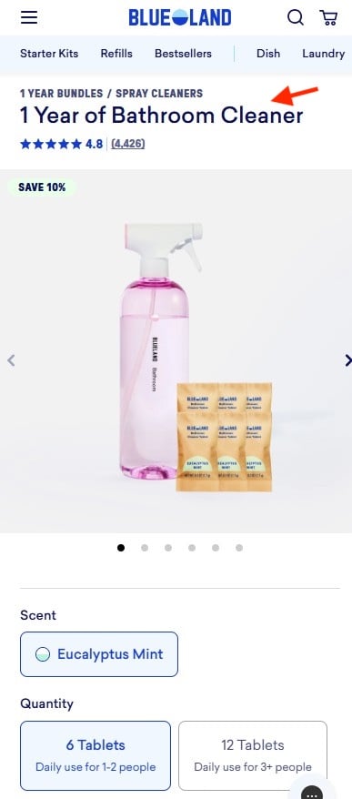
Blueland has fundamentally shifted how household cleaning supplies are sold. Instead of selling "tablets" or "refills"—which forces the consumer to estimate their own usage rate—they frame products by their utility over time, such as "1 Year of Bathroom Cleaner." This labeling strategy provides immediate value context. The shopper no longer needs to estimate their monthly usage; they simply purchase the desired outcome.
Visualizing Portals of Consumption
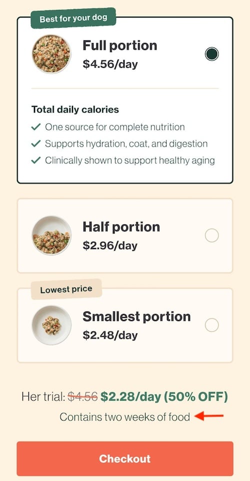
The Farmer’s Dog utilizes visual cues to solve the common anxiety surrounding pet food portions. By illustrating the quantity with images of filled bowls rather than relying on weight (grams or ounces) or box counts, they allow the customer to visualize the product in use. Furthermore, by pricing the product on a "per day" basis, they align the cost with the consumer’s daily routine, effectively normalizing the premium price point and reducing price-based hesitation.
Supporting Data and Industry Implications
The implications of these design choices are quantifiable. A study by Forrester Research found that a well-designed user interface could raise a website’s conversion rate by up to 200%. When these design improvements are coupled with reduced cognitive load, the impact is compounded.
From a business intelligence perspective, minimizing "mental math" also reduces the load on customer support teams. When customers fully understand what they are buying, pre-purchase inquiries regarding product size, quantity, and cost diminish. This represents a dual benefit: higher conversion rates at the front end and lower operational costs at the back end.
Strategic Recommendations for Retailers
To capitalize on these insights, e-commerce managers should perform a "friction audit" of their checkout funnels. This process involves:
- Auditing Language: Replace technical jargon with outcome-based language. Instead of "300ml unit," use "Enough for 30 days of use."
- Visual Verification: Ensure that product images represent the actual quantity being shipped. If selling in bundles, show the bundle, not just the single unit.
- Pricing Context: If selling in subscription or bulk formats, break down the cost into the smallest unit of consumption (e.g., "per day," "per wash," or "per serving") to provide a familiar frame of reference.
- Field Clarity: Use clear, high-contrast labels for quantity selectors. Ensure that the units (case vs. box vs. unit) are explicitly stated in the immediate visual field of the "Add to Cart" button.
The Broader Impact: User Trust and Brand Loyalty
The ultimate goal of reducing cognitive friction is to establish trust. Every time a website forces a user to stop and solve a puzzle, the brand signals that it is not fully aligned with the user’s needs. Conversely, a seamless interface signals professionalism and empathy.
In an era where customer acquisition costs (CAC) are rising across all digital advertising channels, retention and conversion optimization are the most sustainable levers for growth. By treating the customer’s cognitive bandwidth as a finite, valuable resource, retailers can transform their digital storefronts from sources of confusion into engines of conversion. The "reservoir of goodwill," as Krug identifies it, is the most precious asset a brand possesses. Protecting that reservoir through clear, concise, and intuitive design is no longer a luxury—it is a competitive necessity.