Google Wallet rolls out a significant visual overhaul for digital passes on Android devices

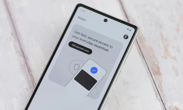
Google Wallet has initiated a widespread rollout of a major design update for digital passes on Android, marking the latest step in a comprehensive multi-year effort to modernize the platform’s user interface. This update follows a significant homepage revamp introduced in May 2026, which integrated advanced search capabilities into the digital wallet experience. The current redesign shifts the presentation of loyalty cards and boarding passes from the traditional small-card format to an immersive, full-screen display that leverages the brand identity of the issuing entity.
The Shift to Immersive Design
For years, Google Wallet and its predecessor, Google Pay, utilized a standardized card-based aesthetic. Digital passes were traditionally displayed as small, rectangular widgets set against a neutral or system-themed Dynamic Color background. While functional, this approach often failed to convey the visual branding of the merchants or airlines issuing the passes.
The new design philosophy replaces this minimalism with a high-impact, full-screen approach. When a user selects a pass, the entire interface adopts the primary color associated with the brand, creating a more cohesive and visually stimulating experience. By extending the branding to the full display, Google is providing merchants with more space to showcase their identity, which could potentially increase engagement with loyalty programs and digital boarding processes.
Beyond the aesthetic shift, the interface has been reorganized for functional efficiency. Key actions—such as phone numbers for customer service or links to official company websites—are now easily accessible by scrolling down. This consolidation moves essential contact and support information from hidden menus directly into the primary viewing area of the pass, reducing the number of taps required to resolve common user inquiries.
Reorganized Settings and User Control
One of the most notable functional changes in this rollout is the relocation of administrative controls. Previously, users had to navigate through a three-dot overflow menu to modify pass settings, such as updating nicknames or toggling specific usage preferences. These options are now integrated directly under the "Settings" header within the full-screen view. This move aligns with Google’s ongoing strategy to flatten the navigation hierarchy across its Material You design language, ensuring that users can manage their digital assets with greater speed and fewer interactions.

Interestingly, Google has maintained a degree of legacy support for users who may prefer the older interface. A "rewind" icon located in the top-right corner of the new pass screen allows users to toggle back to the previous, smaller card-based view. This inclusion serves as a bridge for users accustomed to the original layout, offering a transition period while the new design becomes the standard.
Chronology of Google Wallet’s Evolution
The redesign of digital passes is the latest milestone in a long-term transformation of Google’s financial and identity services. The evolution of the platform can be traced back to several key developments:
- 2022: Google officially rebranded its payment app as Google Wallet, signaling a pivot toward a comprehensive digital identity hub that encompasses not just payment cards, but also transit passes, boarding passes, loyalty programs, digital keys, and health records.
- 2023: Google introduced expanded support for third-party integrations, allowing more merchants to utilize the Wallet API for loyalty and event ticketing.
- May 2026: Google launched a significant update to the Wallet homepage. The integration of a search function allowed users to quickly find specific passes or transactions within a growing library of digital cards, addressing concerns regarding navigation as users began storing more types of data in the app.
- January 2027 (Current): The rollout of the full-screen pass design marks the latest phase in the app’s evolution, focusing on UI consistency and brand-specific visual styling.
Scope of the Redesign
The new design is being applied universally to loyalty cards and boarding passes, including those created manually by users through the app’s import features. However, there are exceptions. Transit cards, which rely on specific NFC protocols and real-time transit data, currently maintain their original design. This distinction is likely intentional, as transit passes require high-speed accessibility at turnstiles and scanners, where the compact, standardized card view remains highly efficient for quick-tap interactions.
Early feedback from the user community indicates that while the new design is objectively more modern and aesthetically pleasing, it introduces some challenges regarding contrast. Some brand-specific background colors can be exceptionally bright, which may cause eye strain for users accessing their boarding passes or loyalty cards in low-light environments, such as during nighttime travel.
Broader Implications and Strategic Context
The decision to move toward a more immersive, branded interface reflects a broader trend in mobile operating systems where developers seek to turn utility apps into richer, more interactive experiences. By allowing brands to own the color palette of the screen, Google is effectively transforming the digital wallet from a simple repository into a high-visibility marketing surface.
Industry analysts suggest that this shift could have significant implications for how retailers interact with their customers. A more visually distinct pass is more recognizable in a user’s list of saved items, and the prominent placement of "call" and "website" buttons suggests that Google intends for Wallet to serve as a primary point of contact for customer service issues.

Furthermore, as the competition between digital wallets—such as Apple Wallet and Samsung Wallet—intensifies, visual differentiation becomes a key metric for user retention. By adopting a design language that feels more premium and customized, Google is attempting to ensure that its platform remains the "default" for Android users, discouraging them from relying on individual merchant apps that might offer similar, albeit fragmented, functionality.
Data Security and Privacy Standards
While the UI is changing, the underlying data architecture of Google Wallet remains anchored in its existing security framework. Digital passes are stored using encrypted tokens rather than raw payment or identification data. The update does not alter the fundamental permissions or privacy settings associated with these passes. Users retain full control over what information is shared with merchants, and the "Settings" menu continues to provide granular control over notifications and data synchronization.
Google has not issued a formal statement regarding future updates to the transit card interface, but industry observers anticipate that the company will eventually bridge the gap between transit and other pass formats as the NFC infrastructure continues to mature globally.
Looking Ahead
As of the current reporting, the redesign is rolling out to a wide user base globally. Users who have not yet seen the update are advised to check the Google Play Store for the latest version of the Google Wallet application. The phased rollout is a standard practice for Google, allowing the engineering team to monitor for performance issues or accessibility complaints before the final, global version is deployed to all active devices.
In conclusion, the redesign of Google Wallet passes represents a logical maturation of the application’s design language. By prioritizing brand immersion and consolidating user controls, Google is refining the user experience to be more intuitive and visually cohesive. While the change may require a minor adjustment period for long-term users, the increased functionality and aesthetic modernization appear to be a strategic move to solidify Google Wallet’s role as an indispensable tool in the daily lives of Android users. As mobile wallets continue to replace physical leather counterparts, the visual clarity and ease of navigation provided by these design updates will be critical in ensuring that the digital transition remains seamless for consumers worldwide.