How Mother Design Transformed Spiritualism into Brand Identity for Psychic Platform Purple Garden

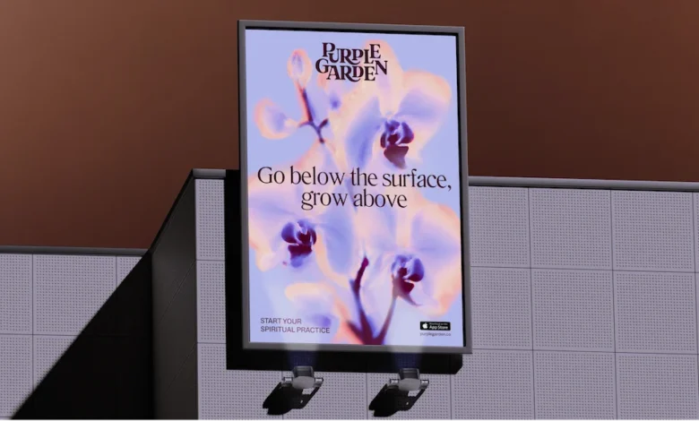
The intersection of modern commercial branding and the intangible world of spiritualism presents a unique paradox for creative agencies. When psychic services platform Purple Garden sought to overhaul its visual and verbal identity, it turned to the globally renowned creative agency Mother Design to spearhead the project. Rather than relying solely on conventional market research, consumer surveys, and standard brand audits, the agency embarked on an unconventional, immersive design process. This unconventional journey involved collaborative workshops, automatic drawing, chakra readings, and a deliberate departure from traditional corporate key performance indicators to capture the essence of intuition and higher consciousness.
The resulting rebrand breathes new life into a digital category that has historically relied on predictable tropes, flat aesthetics, and high-pressure marketing tactics. By blending empirical design strategies with meditative and exploratory artistic practices, Mother Design successfully repositioned Purple Garden as an industry leader, crafting a cohesive visual universe that resonates deeply with seasoned spiritual seekers while appealing to a broader contemporary audience.
Background and Industry Context
The global wellness, spirituality, and esoteric services market has experienced a significant digital migration over the past decade. Platforms offering psychic readings, tarot consultations, dream analysis, and astrological guidance have transitioned from traditional telephone hotlines and local storefronts to sophisticated mobile applications and web-based ecosystems. As competition within the digital wellness sector intensifies, platforms face the challenge of distinguishing themselves in a crowded marketplace while maintaining credibility among dedicated practitioners and clients.
Historically, branding within the psychic services industry has leaned heavily on familiar, albeit cliché, visual shorthand: glowing crystal balls, mystical typography, heavy purples, and an overwhelming sense of urgency driven by transactional messaging like "Book now" or "Get instant answers." While these tactics historically drove short-term conversions, they frequently alienated consumers seeking genuine guidance, emotional resonance, and a deeper connection with holistic practices.
Purple Garden recognized the need to mature its brand presence to solidify its position as a market leader. To achieve this, the company required a sophisticated visual and verbal identity that honored the authenticity of spiritual practices while meeting modern standards of digital design, accessibility, and user experience.
Chronology of the Rebrand: An Immersive Creative Process
The collaboration between Mother Design and Purple Garden unfolded over several months, marked by a deliberate commitment to slow, experimental, and exploratory methodologies. The project was initiated under Mother Design’s internal "Wild Card" initiative, a framework designed to protect experimental time and encourage creative teams to venture outside their comfort zones.
To authentically translate intangible concepts such as psychic energy and intuition into visual assets, the design team initiated a brand audit with a distinct twist. Recognizing that team members possessed varying degrees of familiarity with spiritualism, Mother Design enlisted the expertise of a holistic practitioner from the Purple Garden platform.
The engagement began with a collaborative workshop centered on chakra readings and automatic writing and drawing—techniques historically utilized by early abstract pioneers. Specifically, the design team drew inspiration from Hilma af Klint and The Five, a collective of female artists from the late 19th and early 20th centuries who entered trance states to bypass conscious thought and channel higher consciousness into abstract marks and geometric forms.

During the initial workshops, designers worked instinctively with charcoal, paper, and raw materials, intentionally suspending analytical thought to record physical textures, marks, and emotional impressions. Following a multi-day hiatus, the team reconvened to analyze the generated drawings and writings, extracting organic forms, linework, and visual motifs that would eventually form the foundation of Purple Garden’s new brand architecture.
Visual and Verbal Identity: Decoding the Elements
The culmination of this immersive research phase manifested in a multifaceted visual and verbal system that balances whimsy with practical legibility.
According to Jo Tulej, Creative Director at Mother Design, the primary challenge lay in creating a visual world that felt instantly recognizable to dedicated spiritual practitioners while avoiding tired clichés. The core design elements include:
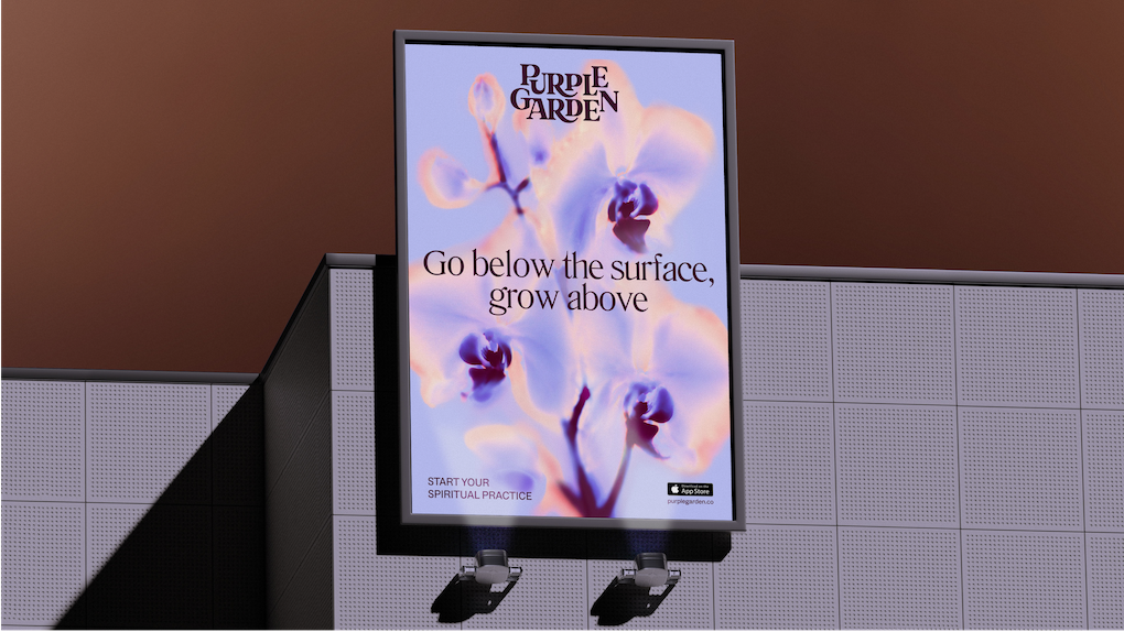
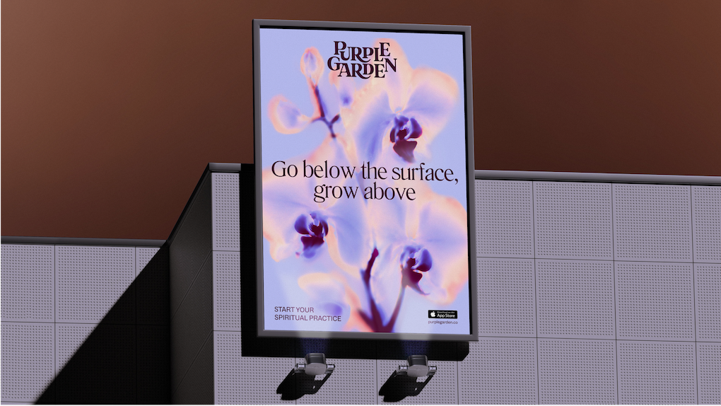
- Typography and Wordmark: The new Purple Garden wordmark features a bespoke combination of elegant serifs and curved junctures. The letterforms are intentionally designed with ligatures that appear to sprout and grow outward, symbolizing continual personal growth and living practice. For body and secondary applications, the team selected Literatura Present and ABC Social typefaces, striking a careful balance between artistic expression and crystal-clear digital legibility.
- Color Palette: While honoring the category’s namesake color, the agency expanded the palette into a richer, earthier spectrum comprising seven distinct hues. This nuanced color system stands apart from the flatter, monochromatic tones traditionally found across competing platforms.
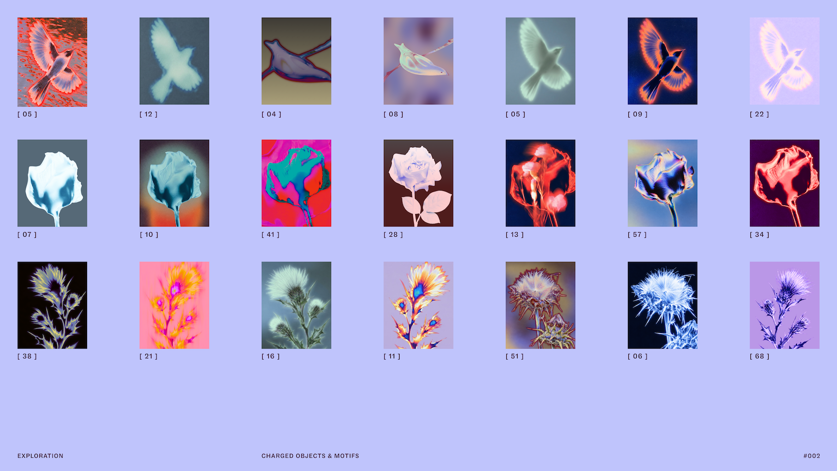
- Imagery and Charged Objects: To visually represent services such as dream analysis and psychic readings, the agency captured imagery of "charged objects" and natural elements. These photographs are transformed through solarized glows and flame-like ripples, symbolizing the energetic exchange between practitioner and client.
- Verbal Identity and Messaging: Moving away from high-pressure sales copy, Mother Design established a guiding voice built around the concept of "Active Contemplation." This tone-of-voice framework is engineered to meet users wherever they are in their spiritual journey, offering either active forward guidance or a slower, more reflective pace.
Comparative Analysis: Mother Design’s Dual Psychic Platforms
The Purple Garden project marks the second major psychic services rebrand undertaken by Mother Design within a single year, following the agency’s work on the platform Keen. Industry analysts and design critics have noted the striking divergence in how the agency approached two brands operating within the same overarching sector.
While Keen’s identity was tailored to its specific audience and business objectives, the Purple Garden rebrand leaned heavily into tactile experimentation, organic growth motifs, and meditative processes. This divergence highlights a sophisticated approach to brand strategy: rather than applying a homogenized template to a specific niche, Mother Design demonstrated that rigorous audience analysis paired with tailored creative exploration yields entirely distinct commercial outcomes.
Implications and Industry Impact
The successful rollout of Purple Garden’s rebrand carries several broader implications for the design and branding industries:

- The Value of Protected Creative Exploration: By prioritizing the "Wild Card" initiative and allocating time for unstructured, experimental workshops, Mother Design successfully bypassed the conventional race-to-market constraints that often dilute creative output. The project illustrates that granting design teams the vulnerability and time to explore intangible concepts can yield more robust, resilient brand systems.
- Elevating Niche Categories: The rebrand demonstrates how companies operating in historically marginalized, misunderstood, or niche commercial sectors can elevate their market standing through high-craft, professional design interventions. By treating spiritualism with artistic seriousness and design rigor, Purple Garden has set a new benchmark for credibility and visual sophistication within digital wellness.
- Shifting Consumer Expectations: As digital consumers become increasingly discerning, branding that relies on aggressive marketing tropes is steadily losing efficacy. Purple Garden’s shift toward a nuanced, contemplative, and visually grounded identity reflects a broader consumer pivot toward authenticity, emotional safety, and thoughtful engagement in digital services.
Conclusion
The transformation of Purple Garden under the guidance of Mother Design stands as a testament to the power of unconventional creative methodologies. By bridging the gap between abstract spiritual experiences and structured commercial design, the collaboration has produced a brand identity that is both deeply rooted in its category and refreshingly innovative. As Purple Garden steps into its next phase as a digital market leader, its new visual and verbal ecosystem ensures that the platform will continue to guide its community with clarity, empathy, and grace.
Related posts: