Welsh National Opera Unveils Modern Rebrand to Challenge Perceptions of Cultural Irrelevance and Celebrate 80 Years of Artistic Innovation

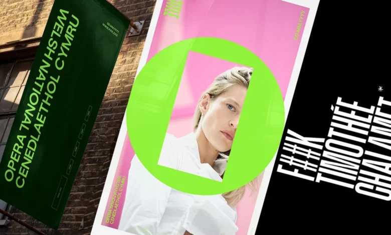
The Welsh National Opera (WNO) has officially launched a comprehensive brand transformation, signaling a bold shift in its visual and cultural identity as it prepares to enter its eighth decade of operation. This strategic overhaul, developed in collaboration with the Welsh design firm Bwtic, arrives at a critical juncture for the performing arts sector. It serves as both a celebration of the company’s upcoming 80th anniversary and a pointed response to contemporary criticisms regarding the accessibility and relevance of opera in the 21st century. By adopting a minimalist, high-energy aesthetic, the WNO aims to dismantle the "elitist" stigma often associated with the medium, repositioning opera as a dynamic, contemporary experience akin to an "electric night out."
The Catalyst for Change: Confronting the Chalamet Controversy
The impetus for the rebrand was partially fueled by a wave of public discourse surrounding the longevity of traditional art forms. Earlier this year, Hollywood actor Timothée Chalamet made a casual remark suggesting that "no one cares about opera and ballet anymore," a comment that resonated across the global arts community. While some institutions responded with humor—notably Seattle Opera’s widely publicized social media campaign—the Welsh National Opera chose to internalize the critique as a challenge to prove the art form’s enduring vitality.
The WNO’s leadership recognized that to survive in an era of rapidly changing consumer habits and shrinking public subsidies, the institution needed to move beyond its traditionalist image. The new branding is designed to refute the notion of opera as a static, historical relic. Instead, it presents the company as a forward-thinking cultural leader capable of producing works that resonate with modern sensibilities, diverse audiences, and digital-first platforms.
The O Frame: A Visual Metaphor for Narrative Dissonance
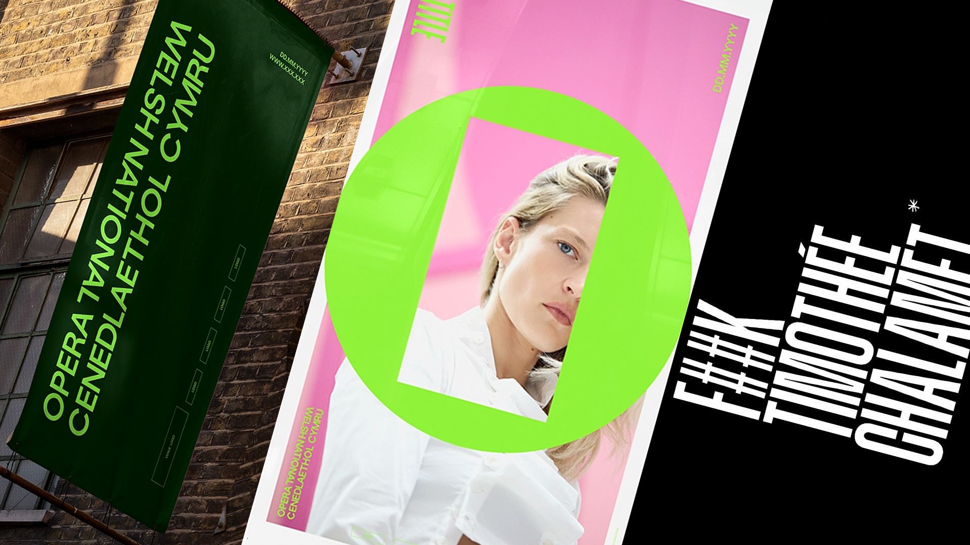
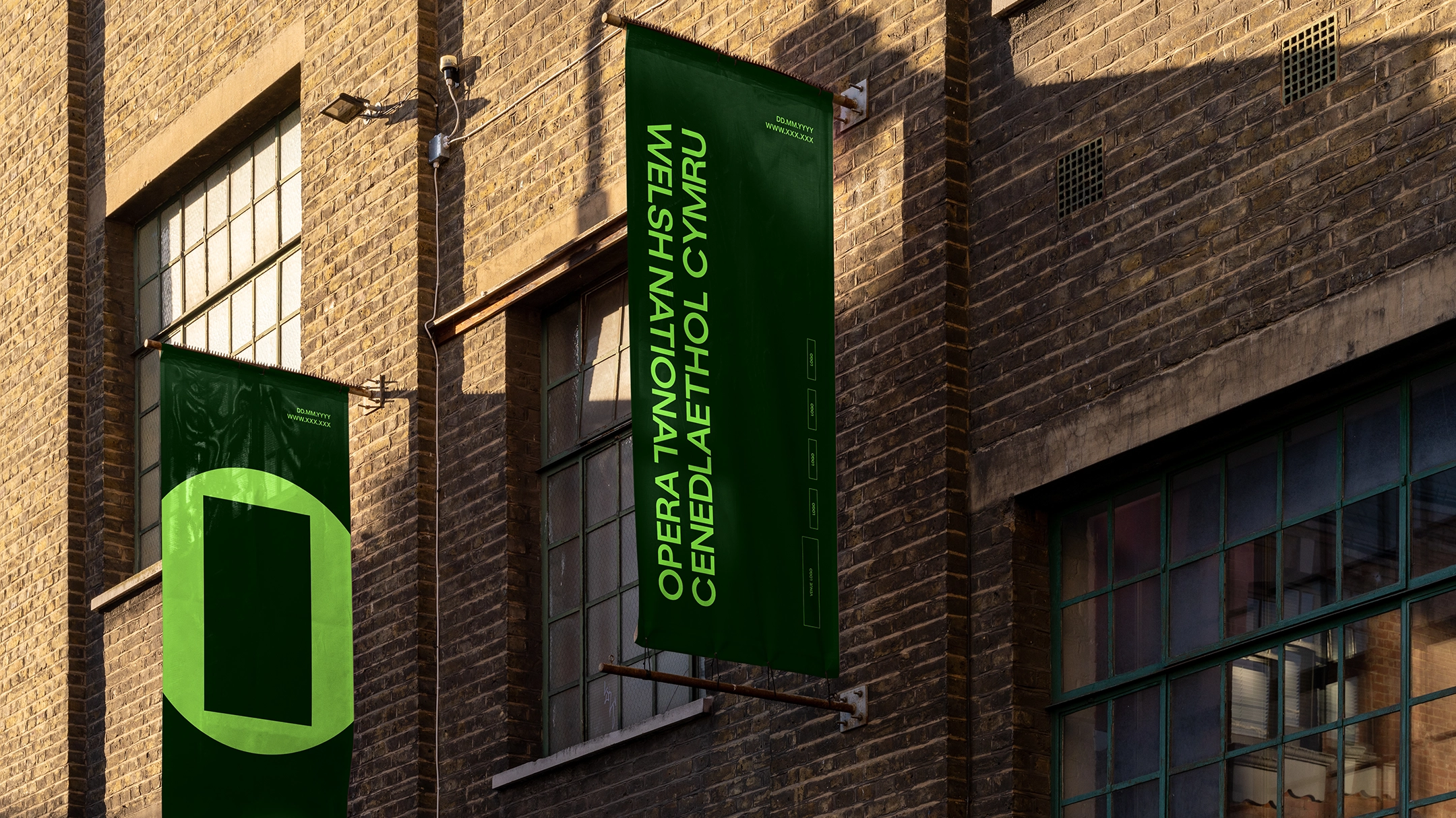
At the center of the new visual identity is a versatile and minimalist mark known as the "O Frame." This geometric device consists of a bold outer circle—representing the letter "O" for Opera—intersected by an open rectangular frame in its center. The design is a departure from the elaborate, often illustrative logos of the past, favoring a clean, architectural approach that allows for maximum flexibility across digital and physical media.
According to the design team at Bwtic, the O Frame was born from a specific frustration: the perception that opera is a singular, monolithic story told in a repetitive way. The new mark functions as a literal and metaphorical window. The outer circle represents the medium of opera itself—the grand, universal vessel of music and performance—while the inner frame represents the individual production, subject matter, or specific message of a play.
The studio has described this relationship as one of "intentional dissonance." By placing a square-edged frame inside a circular boundary, the design mirrors the "square peg, round hole" nature of many operatic narratives, which often deal with societal outliers, tragic conflicts, and the friction between the individual and the collective. This visual tension is intended to spark curiosity and reflect the complex, often challenging themes explored on the WNO stage.
Linguistic Parity and the Bilingual Wordmark
As a national institution of Wales, the WNO carries a significant responsibility to uphold and promote the Welsh language. Historically, Welsh organizations have struggled to find a visual balance between Welsh and English text, often resulting in layouts where one language feels subordinate to the other or the design becomes cluttered by repetition.
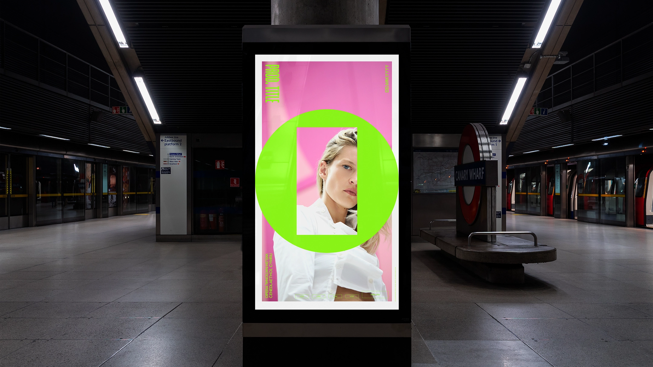
The new branding addresses this through a carefully balanced bilingual wordmark. Rather than stacking the languages in a hierarchy, the design integrates "Welsh National Opera" and "Opera Cenedlaethol Cymru" in a way that allows the reader’s eye to naturally gravitate toward their preferred language first. This approach to "linguistic parity" reflects a broader movement within Wales to ensure that the Welsh language is treated with equal dignity and visibility in the public sphere.
The design studio noted that opera is an art form inherently comfortable with interchanging languages—often performed in Italian, German, or French with subtitles—making it the perfect medium to champion a truly bilingual identity. The new wordmark reinforces the WNO’s role as a bridge between Welsh heritage and international artistic standards.
Historical Foundations and Typographic Evolution
While the rebrand is focused on the future, it is deeply rooted in the company’s history. The WNO was founded in 1943, with its first professional productions taking place in 1946 at the Prince of Wales Theatre in Cardiff. During the research phase of the rebrand, Bwtic delved into the company’s archives, discovering a 1946 promotional poster for its debut season.
The poster featured a condensed, authoritative sans-serif typeface that captured the post-war spirit of ambition and cultural renewal. Inspired by this discovery, the design team utilized GT Standard, a typeface from the Grilli Type foundry, as the basis for the new typographic system. The chosen font is an upper-case, condensed sans-serif that echoes the directness of the 1946 original while providing the technical flexibility required for modern applications.
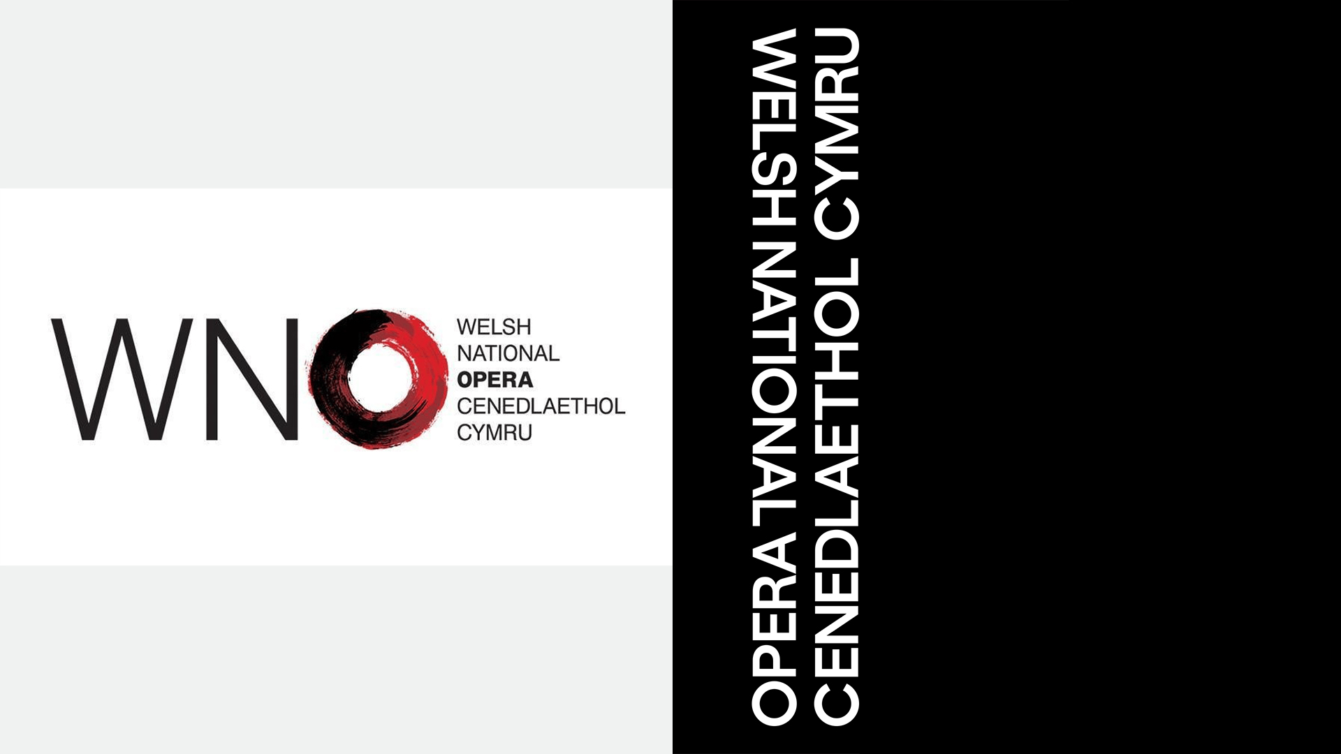
This typographic choice serves as a thread connecting the WNO’s origins to its current mission. It provides a sense of "cultural authority" and "institutional weight," yet remains agile enough to be used in experimental marketing campaigns, digital interfaces, and social media content. The result is a brand voice that feels both established and contemporary—a "modern classic" that respects its lineage without being shackled by it.
The Economic and Strategic Context of the Rebrand
The WNO’s visual transformation comes at a time of significant financial and structural pressure for the UK arts sector. In recent years, major funding bodies, including Arts Council England (ACE) and Arts Council Wales (ACW), have implemented substantial cuts to the core grants of several major opera companies. The WNO, in particular, faced a multi-million-pound reduction in its annual funding, leading to a reduced touring schedule and a public debate about the sustainability of large-scale operatic productions outside of London.
In this context, the rebrand is not merely an aesthetic exercise; it is a strategic necessity. To secure its future, the WNO must expand its donor base and attract younger ticket buyers who may have previously viewed opera as an inaccessible or "stuffy" art form. The "electric night out" positioning is a direct attempt to compete with other forms of high-end entertainment, such as West End musicals, immersive theater, and major concert tours.
By investing in a high-quality, modern brand identity, the WNO is signaling to stakeholders, politicians, and the public that it is an evolving, vital entity worthy of continued investment. The rebrand aims to demonstrate that the company is efficient, relevant, and capable of operating at the highest levels of international design and production.
Broader Implications for the Performing Arts Sector
The Welsh National Opera’s rebrand is part of a larger trend of "rebranding the classics" seen across Europe and North America. As traditional audiences age, cultural institutions are increasingly turning to minimalist design, bold color palettes, and digital-first strategies to stay competitive.
- Accessibility through Design: Modern branding helps lower the "barrier to entry" for new audiences. A sleek, professional logo can make an opera house feel as welcoming and contemporary as a tech brand or a modern art gallery.
- Digital Adaptability: The move toward minimalist icons like the O Frame is driven by the need for brands to remain legible on small smartphone screens and across various social media platforms.
- Institutional Resilience: A strong brand identity provides a cohesive narrative for an organization, making it easier to communicate its mission to diverse audiences, from school children in rural Wales to international critics in New York or Milan.
The WNO’s transformation also highlights the importance of place-based branding. By leaning into its Welsh identity and the unique challenges of bilingualism, the WNO has created a brand that could not belong to any other opera company in the world. It is a specific, proud assertion of Welsh culture on the global stage.
Conclusion: A New Chapter for Welsh Culture
As the Welsh National Opera moves toward its 80th anniversary, the new visual identity serves as a manifesto for its future. By rejecting the "dying art form" narrative and embracing a bold, dissonant, and bilingual aesthetic, the company has positioned itself as a resilient leader in the cultural landscape.
The rebrand, while a direct response to the "Chalamet controversy," ultimately transcends the comments of a single actor. It is a comprehensive effort to ensure that the power of opera—its grand emotions, complex stories, and world-class music—continues to find an audience in an increasingly noisy digital world. Through the O Frame and its new typographic system, the Welsh National Opera is ready to prove that after eight decades, its voice is louder and more relevant than ever.