Google brings Liquid Glass design to iOS apps as Material 3 expansion continues across the platform

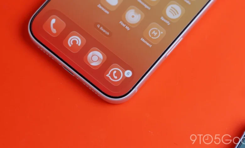
The ongoing convergence of design languages between Google’s Android and iOS ecosystems has reached a new milestone as the Mountain View-based technology giant begins rolling out its "Liquid Glass" aesthetic to its core suite of iPhone and iPad applications. One year after the initial introduction of Liquid Glass—a design paradigm characterized by deep translucency and fluid blur effects—Google is finally integrating this sophisticated visual layer into its iOS portfolio, marking a significant departure from the static, opaque interface elements that have defined its mobile software for years.
This update, most notably observed in the latest iteration of Google Photos (version 7.94), signifies a broader commitment to the Material 3 Expressive design language. By replacing solid-color backgrounds with adaptive, semi-transparent elements, Google is attempting to align its iOS footprint more closely with the visual expectations of Apple’s Human Interface Guidelines while maintaining the distinct "Googley" character of its proprietary design system.
A Chronology of Design Evolution at Google
To understand the significance of this update, one must consider the timeline of Google’s design philosophy. For much of the last decade, Google utilized "Material Design," a flat, card-based interface language that emphasized depth through drop shadows and clear, distinct layers. When Material You and later Material 3 were introduced for Android 12, the focus shifted toward personalization and dynamic color extraction, allowing the interface to adapt to the user’s wallpaper.
However, bringing these features to iOS proved difficult due to the restrictive nature of Apple’s sandbox environment. In 2025, Google unveiled "Liquid Glass," a design initiative specifically aimed at Apple’s platform. This language prioritized frosted-glass textures, which mimic the native blur effects seen in iOS’s Control Center and dock.
Over the past twelve months, the deployment of Liquid Glass has been gradual. It began with experimental widgets and secondary interface elements, but the recent update to Google Photos represents a move toward primary navigation components. Previously, the floating bottom bar in Google Photos mirrored its Android counterpart, utilizing a solid background that often felt disconnected from the airy, glass-like aesthetic common in native iOS applications. With version 7.94, that bar is now translucent, allowing images to subtly bleed through the navigation, creating a sense of spatial depth that feels significantly more native to the iPhone experience.
![Google combines Material 3 Expressive & Liquid Glass on the iPhone [Gallery]](https://9to5google.com/wp-content/uploads/sites/4/2026/03/Liquid-Glass-dock-on-iPhone-17-Pro-Max.jpg?quality=82&strip=all&w=1600)
Technical Implementation and User Customization
The implementation of Liquid Glass in Google Photos introduces a granular level of control that is relatively rare for Google’s cross-platform apps. Users are presented with distinct translucency settings, labeled as "Default" and "More clear." These settings essentially manipulate the alpha channel of the background blur, allowing users to prioritize either legibility or aesthetic immersion.
In the "More clear" setting, the content behind the navigation bar becomes more perceptible, providing a cleaner look that emphasizes the photography-centric nature of the app. Conversely, the "Default" setting offers a balance between contrast and transparency. Furthermore, the integration with iOS’s dark mode is seamless; when the system theme is toggled, the Liquid Glass elements adjust their tinting. Specifically, the accent color—often a subtle blue or primary Google shade—tints the current tab indicator, creating a visual harmony between the active UI element and the underlying translucent substrate.
Beyond the Photos app, Google Health has also received a significant visual overhaul. The traditional navigation bar, which houses the primary directory of the application, now utilizes the same frosted treatment. Perhaps most notable is the "Ask Coach" floating action button (FAB). By applying a frosted finish to this primary interactive element, Google is signaling that it is moving away from the high-contrast, "pop-out" style of older Material Design iterations in favor of a more cohesive, integrated look that respects the underlying content.
The Material 3 Transition Strategy
Despite these advancements, the transition to Material 3 is far from complete across Google’s iOS ecosystem. The company is currently engaged in a systematic phasing out of its older "Google Material Theme" design language. While high-traffic applications like Google Tasks have been updated to reflect the new standards, legacy apps such as Google Docs, Sheets, Slides, and Keep have lagged behind.
This disparity in design consistency is a known challenge for large-scale software developers. Maintaining two distinct codebases—one for Android and one for iOS—while ensuring a unified design identity requires significant engineering overhead. Google’s reliance on its own proprietary UI frameworks, which are designed to sit on top of the native operating system, often results in a "catch-up" period where iOS users wait months, or even years, for features that have long been standard on Android.
Fact-Based Analysis of Design Limitations
The persistent question among mobile enthusiasts and developers remains the absence of "Dynamic Color" on iOS. Dynamic Color, the hallmark of Material You, allows an Android interface to pull color palettes from a user’s wallpaper. On iOS, this is technically unfeasible due to Apple’s system architecture, which restricts third-party apps from accessing the system-wide wallpaper or the color data derived from it.
![Google combines Material 3 Expressive & Liquid Glass on the iPhone [Gallery]](https://9to5google.com/wp-content/themes/ninetofive/dist/images/google-preferred-source-badge-dark.png)
Some analysts have speculated that Google could implement a manual color-selection system, where users define an accent color within the app settings. However, such a feature would likely be perceived as redundant. Without system-wide integration, the ability to change the accent color in one app while the rest of the iOS ecosystem remains locked to native or static branding would create a disjointed user experience. Therefore, Google’s decision to focus on Liquid Glass—which relies on light, shadow, and transparency rather than color extraction—is a pragmatic, albeit constrained, approach to modernization.
Broader Implications for Google’s iOS Strategy
The shift toward Liquid Glass underscores a broader change in how Google views its presence on Apple’s hardware. Historically, Google often treated its iOS apps as secondary citizens, prioritizing feature parity with Android above all else. More recently, there has been a clear pivot toward "platform-first" design, where Google apps are encouraged to look and feel like they belong on the device they are running on.
By adopting the frosted glass aesthetic, Google is acknowledging that iOS users have a specific set of visual expectations—namely, that UI elements should be light, translucent, and responsive to the content behind them. This is not merely an aesthetic choice; it is a retention strategy. As users become increasingly accustomed to the refined, glass-heavy look of iOS 17 and 18, applications that remain flat and opaque can feel outdated or jarring.
Furthermore, the integration of these design elements across the Google Health and Photos ecosystems suggests that the company is building a shared design library that will eventually be applied to the remainder of its productivity suite. The lagging status of Docs, Sheets, and Slides is likely a temporary hurdle, with engineers prioritizing apps that rely more heavily on media consumption and navigation before tackling complex, data-heavy productivity tools.
Conclusion and Future Outlook
As Google continues its migration to Material 3 Expressive, the role of Liquid Glass will undoubtedly expand. While the current implementation in Google Photos and Google Health serves as a proof-of-concept, the future will likely see this design language integrated into everything from the Google Search app to the Chrome browser on iOS.
The company faces a delicate balancing act: it must retain its recognizable brand identity—the familiar Google blue, red, yellow, and green palette—while simultaneously blending into the aesthetic environment provided by Apple. The move toward translucency is a sophisticated middle ground, allowing Google to remain distinct while embracing the visual fluidity that defines the modern smartphone experience. As the company continues to sunset its older Material Theme design language, the focus will shift from "if" these apps will look modern to "how" they can continue to innovate within the rigid, high-standard confines of the iOS ecosystem. For now, the rollout of Liquid Glass serves as a clear indication that Google is listening to the design feedback of its iOS user base, ensuring that its suite of apps remains competitive in an increasingly design-conscious market.