Google Messages is testing a major homepage redesign that features three core components.

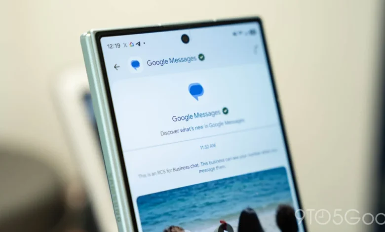
The landscape of mobile communication is undergoing a significant shift as Google continues to iterate on the Google Messages platform, aiming to streamline user interaction and integrate advanced AI capabilities directly into the core messaging experience. In addition to a recently debuted app icon featuring a fresh gradient design, Google is now testing a substantial overhaul of the application’s home screen interface. This update, currently surfacing within the beta channel, introduces a trio of structural changes: a revamped approach to pinned conversations, a dynamic floating action button (FAB) for search and chat initiation, and a refined placement for the Gemini AI shortcut.
Evolution of the User Interface: A Chronology of Change
Google Messages has long served as the default SMS and RCS (Rich Communication Services) client for Android devices. Over the past twenty-four months, the platform has transitioned from a utility-focused application into a feature-rich communication hub.
The current testing phase represents the latest in a series of aesthetic and functional adjustments. In early 2026, Google began prioritizing the integration of generative AI through Gemini, moving it from a peripheral tool to a central fixture of the user experience. By November 2026, the development team accelerated efforts to declutter the home screen, leading to the current experiment where specific UI elements—such as the Gemini shortcut—are being relocated to match the design language seen across Google’s broader Workspace ecosystem, including Gmail and Google Drive.
The New Pinned Chat Experience
Perhaps the most significant visual departure from the current standard is the new treatment of pinned chats. Traditionally, pinned conversations in Google Messages remained integrated within the primary list, distinguished only by a small icon or a slightly altered position at the top.
The new design elevates these conversations into a dedicated horizontal strip at the top of the interface. By utilizing the screen real estate currently reserved for the app logo, search bar, and account menu, Google is shifting toward a design aesthetic reminiscent of iMessage on iOS. While this provides a cleaner, more visual way to identify frequent contacts through high-resolution avatar bubbles, it introduces a functional trade-off. Users will no longer see the most recent message snippets or timestamps for these pinned threads directly from the homepage, requiring a tap into the thread to ascertain the latest update. This reflects a design philosophy that prioritizes quick access to specific people over the immediate visibility of message metadata.
Adaptive Navigation and Bottom Search
The second core component of this redesign focuses on the "Floating Action Button" (FAB) and search functionality. In the current iteration, search is often relegated to a static bar at the top, while a standalone "Start chat" button sits in the bottom right.
The new configuration shifts these elements to the bottom of the screen, housing them within a centralized, adaptive pill-shaped container. This dual-purpose button dynamically adjusts its appearance based on user behavior:

- Active State: When the user is at the top of their inbox, the interface displays a clearly labeled "Search" and "Start chat" option, optimized for one-handed usage.
- Scroll State: As the user scrolls down the message list, the interface intelligently collapses the button, displaying a compact magnifying glass icon alongside a minimized "Start chat" trigger.
This animation-heavy approach is designed to maintain visibility without obstructing the flow of the inbox. By moving these controls to the bottom, Google is effectively acknowledging the increasing screen sizes of modern Android smartphones and the necessity of thumb-friendly interface design.
Integration of Gemini AI
The third pillar of this update is the relocation of the Gemini shortcut. Previously occupying space as a prominent floating action button, the Gemini entry point is being moved to the top-right corner of the screen, adjacent to the user’s profile avatar.
This shift serves two purposes: first, it clears space on the screen for a more focused messaging list; second, it standardizes the placement of AI features within the Google app suite. By aligning with the desktop and mobile versions of Google Workspace, the company is conditioning users to associate the top-right corner with advanced intelligence and account-level settings.
Broader Impact and Industry Implications
The testing of these features in the beta channel provides insight into Google’s broader strategy for Android’s communication ecosystem. As the company continues to push for universal RCS adoption, the app must balance the needs of power users who engage with AI and group chats with the needs of casual users who prioritize simplicity.

From an industry perspective, these design changes signal a move toward "feature parity" with competing platforms. The shift toward avatar-based pinned chats is a direct acknowledgment of the visual language that has defined modern mobile messaging. Furthermore, by moving AI to a dedicated, non-intrusive corner, Google is attempting to lower the barrier to entry for its generative AI tools, embedding them into the workflow rather than forcing them upon the user as a primary, disruptive interaction point.
Data and User Experience Considerations
While the current update is in a piecemeal rollout phase, the implications for user experience (UX) are measurable. Data from similar redesigns in other messaging applications suggests that "top-loading" pinned contacts generally increases engagement with those specific users, though it can decrease the discoverability of older, unpinned threads.
For the average user, the shift to a bottom-centric navigation bar is largely viewed as a positive ergonomic improvement. According to internal research from the Android design team regarding one-handed usability, buttons placed within the bottom 30% of the screen are significantly more likely to be utilized than those placed in the top header.
Official Perspectives and Future Rollout
While Google has not released a formal press statement detailing the full roadmap for these changes, company representatives have historically emphasized that these experiments are iterative. Feedback collected via the Google Messages beta program on the Play Store is likely the primary driver behind the staggered rollout.

Because the features are being delivered via server-side updates, not all beta testers will see the changes simultaneously. This allows the engineering team to monitor for performance regressions, such as latency in the search animation or potential crashes when loading the new pinned chat header. If the data remains positive, a wider rollout to the stable version of the app is expected in the coming months, likely accompanying a future Android security patch or a "Feature Drop."
Conclusion
The current redesign of Google Messages is an exercise in balancing form and function. By rethinking how users interact with their most important contacts and how they initiate searches, Google is positioning the app as a more modern, efficient, and AI-capable communication tool.
The move toward a bottom-heavy interface, the cleaner handling of pinned conversations, and the strategic placement of the Gemini shortcut all point toward a more cohesive Google ecosystem. As the rollout continues, the focus will remain on whether these design choices successfully increase user engagement without alienating those who rely on the simplicity of the existing, text-heavy layout. For now, the beta testing phase remains the crucible where these design choices are being tested against the realities of diverse user habits, ensuring that when the update eventually reaches the mass market, it provides a stable and intuitive foundation for the next generation of mobile messaging.