Google Messages Redesign Sparks Debate Among Beta Testers Over iOS-Inspired Pinned Chats and Search Layout Changes

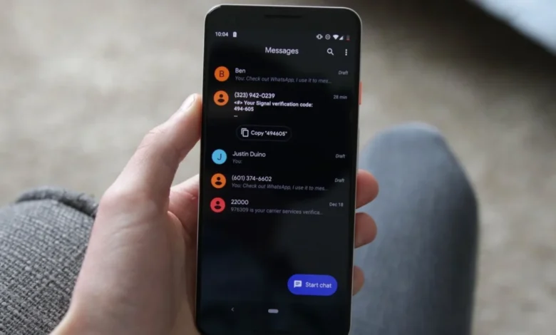
Google is currently rolling out a significant user interface redesign for its flagship messaging application, Google Messages, to select beta testers. The visual update introduces a modernized look for pinned conversations that heavily draws inspiration from Apple’s iMessage, alongside experimental adjustments to the app’s internal search mechanics. While the refresh aims to deliver a more visually striking and spacious layout, it has quickly generated a polarized response within the Android community. Beta testers have taken to community forums such as Reddit to debate the practical implications of the aesthetic overhaul, raising concerns about screen real estate, navigational efficiency, and overall usability.
Main Facts of the Google Messages Redesign
The ongoing beta rollout, observed in builds such as version 20261030_00_RC00, introduces a dedicated horizontal space at the top of the message list specifically for pinned conversations. Unlike previous iterations of the application, which featured smaller, compact entries alongside larger contact imagery, the new layout emphasizes prominent contact photos and a distinct separation between favorite chats and standard message threads.
In addition to the pinned chat modification, Google is experimenting with a relocated search interface. Rather than keeping the search bar in its traditional position, the redesign implements a floating action button (FAB) positioned next to the "Start chat" prompt. This button dynamically alters its appearance based on the user’s scroll position, shifting between a circular magnifying glass icon and an expanded pill-shaped search trigger.
The distribution of these features is currently handled via server-side updates managed directly by Google. Consequently, availability remains inconsistent even among users running identical application builds. For instance, owners of recent hardware, such as the Pixel 9 Pro, have reported receiving the updated interface without requiring explicit Google Play Store updates, whereas other users on the same software version retain the legacy layout.
Chronology and Evolution of Google Messages Layouts
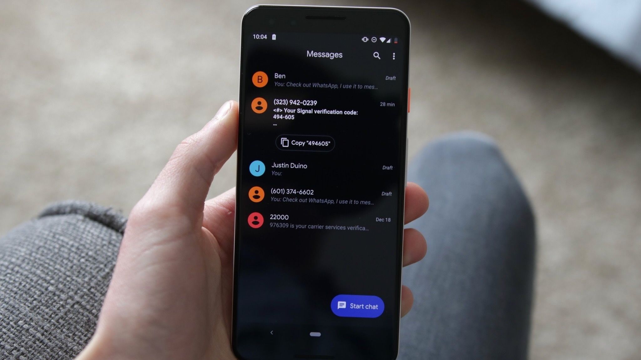
The evolution of Google Messages reflects a broader industry trend toward aesthetic parity and functional unification across mobile operating systems. Over the past several years, Google has progressively overhauled the application’s design language to align with Material You guidelines, introducing dynamic color-theming, streamlined menu structures, and enhanced cross-device synchronization capabilities via Rich Communication Services (RCS).
The introduction of pinned conversations was initially deployed as a productivity feature allowing users to anchor essential chats to the top of their inbox, preventing high-priority threads from getting lost beneath incoming messages. Early versions of this feature maintained a compact list format that integrated seamlessly into the standard vertical message stream.
As Google integrated advanced features—such as deep Google Gemini AI integrations, media organization tabs, and expanded chat pinning limits (which recently scaled up to 20 pinned conversations)—the application’s home screen began to experience visual congestion. The current beta test represents Google’s attempt to address this crowding by structurally segregating favorite chats from regular correspondence, marking a departure from Android’s historically dense information-first design philosophy toward a more minimalist, whitespace-heavy aesthetic reminiscent of iOS.
Community Reactions and Beta Tester Feedback
Early feedback gathered from the Google Messages Reddit community highlights a sharp divide among power users and long-time Android enthusiasts. Proponents of the redesign praise the cleaner visual hierarchy, noting that larger contact photos make it significantly easier to identify and access frequently contacted individuals at a glance. For users managing extensive communication lists, the dedicated top-tier space provides a more organized entry point into daily messaging.
Conversely, a substantial segment of the beta testing community has voiced strong criticisms regarding the layout’s spatial efficiency. The primary grievance centers on the vertical footprint consumed by the expanded pinned chat section. Because the larger contact photos and dedicated banner occupy a greater portion of the upper display, standard and recent unpinned conversations are pushed further down the screen. This displacement forces users to engage in additional scrolling to access messages that fall outside the pinned threshold.
Furthermore, early testers have identified minor visual anomalies within the new interface. Accounts from beta users highlight awkward empty placeholder slots that appear when a user pins only a minimal number of conversations—typically fewer than six. While these empty spaces automatically resolve as additional chats are pinned, they contribute to a disjointed visual experience during the transitional phase. Additional technical complaints include occasional animation stuttering and inconsistent UI element rendering across varying screen resolutions and device form factors.
Broader Implications for Android Design Standards
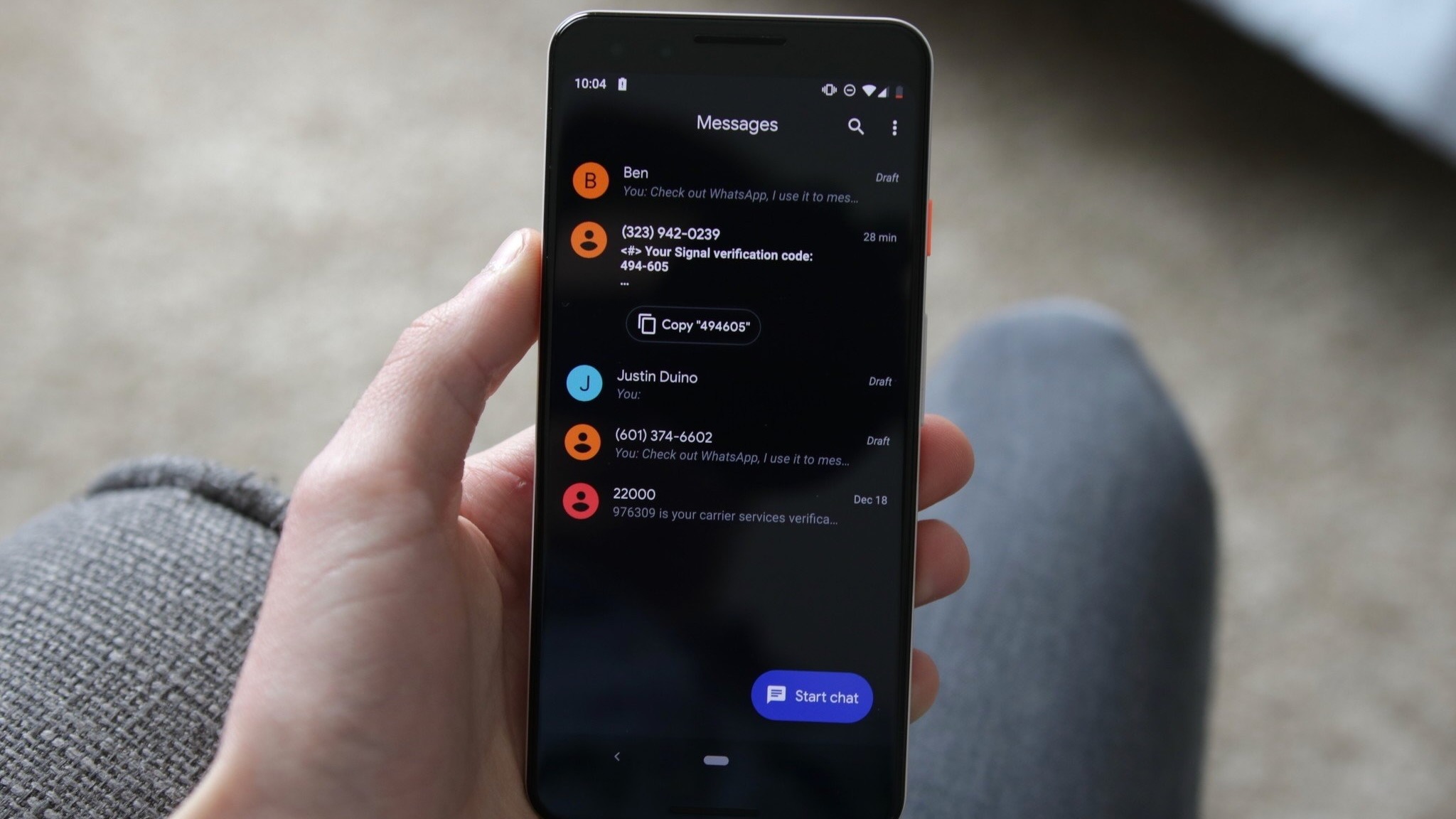
The stylistic direction of the Google Messages redesign carries significant implications for the broader Android ecosystem. For over a decade, Android’s design philosophy has prioritized information density, allowing users to consume maximum data within a single viewport without excessive scrolling. By adopting design patterns that favor expansive whitespace and prominent graphical avatars—hallmarks of Apple’s iOS—Google is signaling a willingness to trade information density for aesthetic clarity.
This shift may alienate traditional Android users who value efficiency and speed, while potentially lowering the barrier to entry for consumers migrating from competing platforms. However, usability experts note that major platform transitions often require granular customization options to satisfy disparate user bases. The absence of a native toggle allowing users to switch between compact and expanded pinned chat layouts remains a notable omission in the current beta release.
Furthermore, the relocation of core navigation elements, such as the search function, introduces a learning curve for established users. Moving search functionality into a dynamic floating action button alters established muscle memory, requiring users to adapt to context-aware interface elements that shift shape during scrolling.
Outlook and Future Stable Release Expectations
As of now, Google has not officially announced a target release date for the stable rollout of these interface changes. Because the features are currently restricted to the beta channel and managed via staggered server-side activations, developers retain a significant window of opportunity to refine the user experience based on ongoing telemetry and community feedback.
Industry analysts suggest that consumer pushback during the beta phase could prompt Google to introduce user-configurable settings, such as a toggle to collapse the pinned chat section or revert to a traditional list view. Until Google provides official documentation or releases a wider public update, the future composition of the Google Messages home screen remains fluid, leaving developers and users alike to navigate the ongoing transition as these experimental features continue to evolve.
Related posts: