Coca-Cola Faces Social Media Backlash as New Better With Typography Draws Comparisons to Marlboro Cigarette Branding

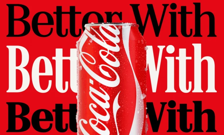
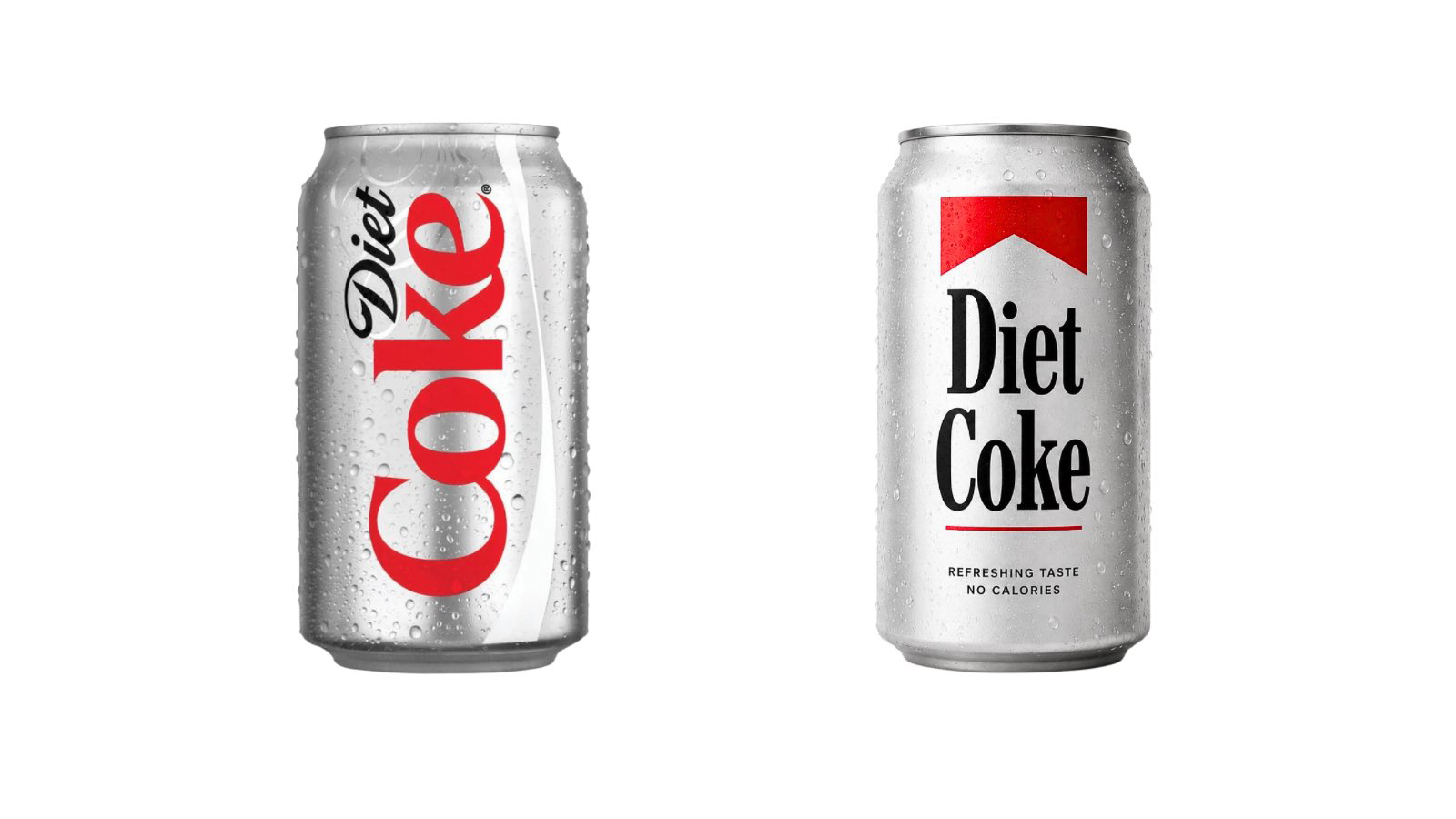
Coca-Cola has unveiled a comprehensive transformation of its global brand identity, marking a significant strategic shift toward a design system that places expressive typography at the center of its visual narrative. This overhaul, led by the renowned design agency Jones Knowles Ritchie (JKR) in collaboration with Brody Associates, introduces a much more prominent application of the "Better With" typeface. While the beverage giant intended to evoke a sense of heritage, playfulness, and modern movement, the rollout has been met with an immediate and vocal reaction from the design community and the general public alike. Social media users have quickly identified an uncanny resemblance between the new serif font and the iconic typography used by Marlboro cigarettes, sparking a broader conversation about the visual language of addictive consumer products.
The "Better With" typeface was not originally conceived for a full-scale identity reboot. It first appeared in 2023 as part of a localized holiday campaign. However, its success led the Coca-Cola Company to integrate it into the core of its global marketing and packaging strategy. According to Brody Associates, the creative studio responsible for the font’s development, the typeface was designed to "express the brand’s unique personality" by blending Coca-Cola’s "rich serif font heritage with modern-day requirements." Despite these intentions, the heavy, high-contrast serif letters, when paired with Coca-Cola’s signature red and white color palette, have drawn inevitable comparisons to the branding of the world’s most famous tobacco product.
The Evolution of Coca-Cola’s Visual Identity
To understand the weight of this design shift, it is essential to examine the historical trajectory of Coca-Cola’s branding. Since its inception in 1886, the brand has been synonymous with its Spencerian script, a flowing, calligraphic logo created by Frank Mason Robinson, the bookkeeper of the drink’s inventor, John Pemberton. For over a century, this script has served as the primary anchor of the brand, surviving numerous "modernization" attempts, including the ill-fated "New Coke" era of the 1980s.
In the early 2000s and 2010s, Coca-Cola leaned heavily into a minimalist aesthetic, often stripping away secondary design elements to focus on the white ribbon (the "Dynamic Ribbon") and the script logo. However, as the digital landscape evolved, the company recognized a need for a more versatile typographic system that could communicate different moods and sub-brands without relying solely on the primary logo.
The 2024 overhaul represents a departure from this minimalism. By elevating the "Better With" font, Coca-Cola is attempting to reclaim a "retro-humanist" feel. The design industry has seen a resurgence in 1970s-style serif fonts, which are often perceived as warmer and more authentic than the sterile sans-serifs that dominated the 2010s. JKR, the agency behind the successful retro-rebrand of Burger King, appears to be applying a similar logic here: looking into the archives to find a "new heritage" that feels both nostalgic and fresh.
The Marlboro Comparison: A Visual and Cultural Analysis
The comparison to Marlboro branding is not merely a matter of font choice; it is a convergence of several design elements. Marlboro’s identity, famously refined by Leo Burnett in the 1950s, relies on a bold, slab-serif typeface and a distinct "chevron" or "roof" shape in red and white. While the "Better With" font is a more traditional serif than Marlboro’s slab-heavy Neo-Grotesque variants, the weight of the strokes and the sharp terminals create a similar visual "vibe."
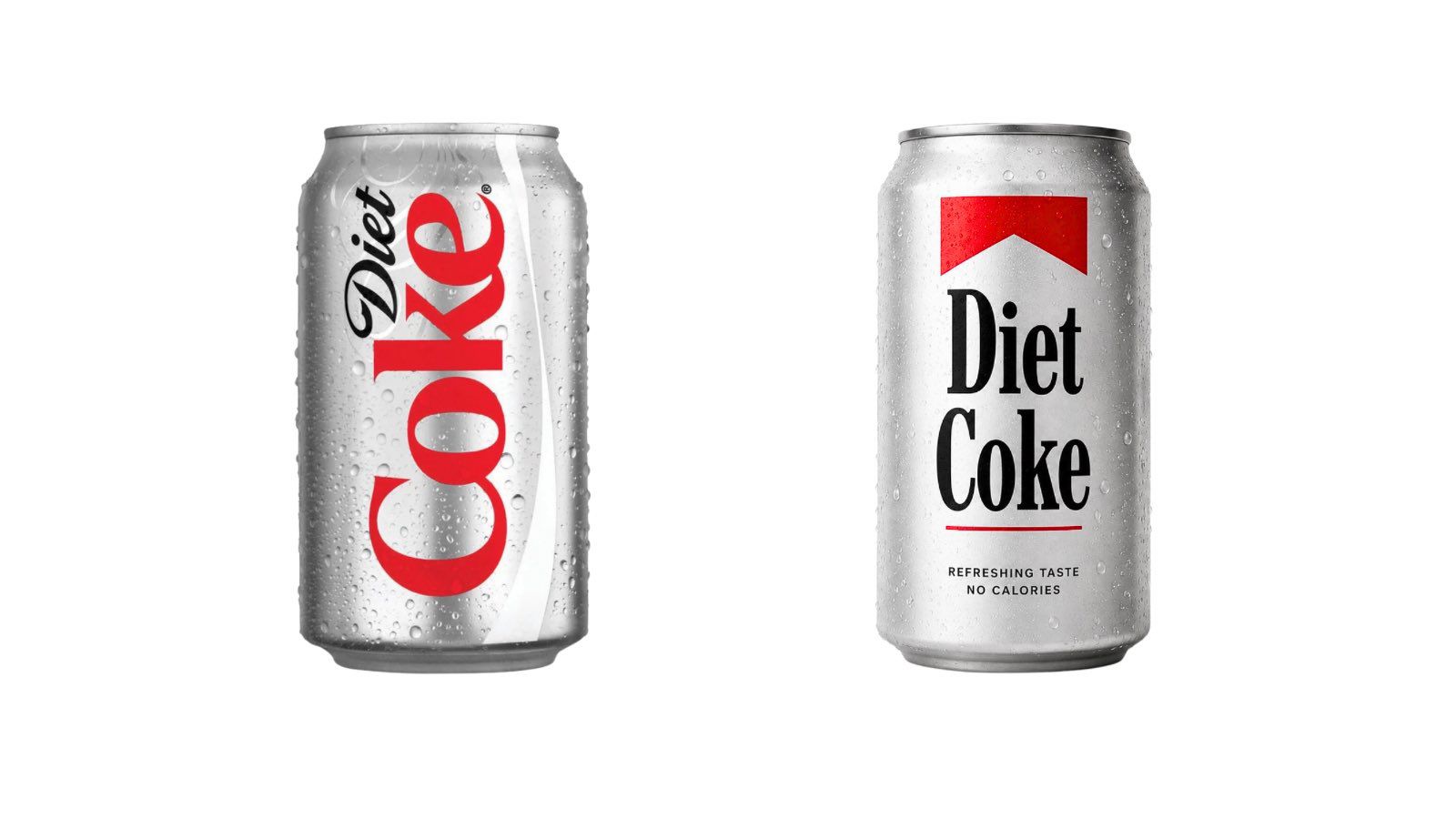
Social media platforms, particularly X (formerly Twitter) and TikTok, have been flooded with mock-ups and side-by-side comparisons. One viral post featured a Diet Coke can reimagined with Marlboro-style layout, garnering thousands of likes and shares. Commentators have noted the irony of the situation, with one user stating, "Coca-Cola switching to a Marlboro font lookalike is the most self-aware thing a sugar company has ever done."
This sentiment touches on a deeper cultural shift. In recent years, public health advocates and regulators have increasingly drawn parallels between the tactics used by the tobacco industry and those used by the "Big Soda" industry. The choice of a font that subconsciously links the two has been described by some critics as an "unfortunate coincidence" and by others as a "freudian slip" in corporate branding.
Supporting Data: The Regulatory Landscape of Sugar and Tobacco
The timing of this design controversy is particularly sensitive given the global regulatory environment. Governments worldwide have been implementing measures to reduce the consumption of high-sugar beverages, mirroring the historical crackdown on tobacco.
- The Sugar Tax Movement: According to data from the World Health Organization (WHO), over 85 countries have implemented some form of tax on sugar-sweetened beverages (SSBs). In the United Kingdom, the Soft Drinks Industry Levy (SDIL), introduced in 2018, has forced many brands to reformulate or face significant price increases.
- Plain Packaging and Labeling: In some jurisdictions, there have been calls for "graphic warning labels" on soda bottles, similar to the images of diseased lungs found on cigarette packs. While these measures have not yet reached the severity of tobacco regulations, the trend toward de-glamorizing sugary drinks is undeniable.
- Consumer Sentiment: Market research indicates that Gen Z and Millennial consumers are increasingly health-conscious. A 2023 report by Mintel suggested that "sugar reduction" is the top priority for 54% of consumers when choosing beverages. For a brand like Coca-Cola, which is trying to maintain its "cool" factor among younger demographics, an accidental association with the "old world" vice of smoking is a significant PR hurdle.
The "Fridge Cigarette" Phenomenon
The backlash also intersects with a specific internet subculture. On TikTok, the term "fridge cigarette" has become a popular meme used to describe Diet Coke. The term suggests that for many people, cracking open a cold can of soda serves the same ritualistic, stress-relieving purpose that a cigarette break did for previous generations.
By adopting a font that mimics the aesthetic of the tobacco industry, Coca-Cola has inadvertently leaned into this meme. While the company likely aimed for "classic Americana," they have landed on "addictive indulgence." For a brand that spends billions of dollars annually on "Real Magic" marketing campaigns designed to associate their product with happiness and togetherness, this shift toward a more "illicit" aesthetic is a risky gamble.
Official Responses and Strategic Intent
While Coca-Cola has not directly addressed the Marlboro comparisons in an official press release, the company’s leadership has been vocal about the goals of the JKR-led redesign. The objective was to create a "unified design system" that works across all platforms—from tiny smartphone screens to massive physical billboards.
Brody Associates defended the "Better With" font by highlighting its archival roots. They noted that the design was "inspired by the company’s archive," specifically looking at 19th-century typography and the early 20th-century advertisements that predated the dominance of the Spencerian script. From a purely historical perspective, the serif font belongs to the same era of commercial printing that birthed many classic American brands, including several tobacco companies.
JKR, for its part, has emphasized that the new identity is about "playfulness and movement." The agency’s work often involves taking a brand’s most recognizable assets and "cranking them up to eleven." In this case, the use of typography is intended to make the brand feel more editorial and lifestyle-oriented, rather than just a product on a shelf.
Broader Implications for Brand Design
The Coca-Cola controversy highlights a growing challenge for global brands: the "New Heritage" trap. As brands attempt to move away from the "blandness" of modern sans-serif typography, they are looking backward to find inspiration. However, the visual language of the past is fraught with associations that may not align with modern values.
1. The Risk of Nostalgia: Retro-branding can be a powerful tool for building trust and authenticity. However, if the nostalgia is not carefully curated, it can evoke the wrong era or the wrong industry. For Coca-Cola, the "Better With" font evokes a mid-century period when both soda and cigarettes were marketed without the weight of modern health data.
2. The Power of Color and Typography: The combination of red and white is one of the most powerful "brand codes" in the world. When a brand owns a color so completely, any change to the secondary elements (like typography) will be magnified. Coca-Cola and Marlboro both occupy the "power red" space, meaning their typographic choices must be distinct enough to avoid confusion.
3. Digital vs. Physical Branding: One of the primary drivers of this redesign was the need for "legibility at speed" in digital environments. Serif fonts, while traditionally considered harder to read on screens than sans-serifs, have seen a resurgence as screen resolutions have improved. The "Better With" font provides a level of detail and "texture" that a flat sans-serif lacks, which is crucial for standing out in a crowded social media feed.
Conclusion: A Turning Point for the Red and White Giant
The launch of Coca-Cola’s new identity serves as a case study in the complexities of modern branding. What was intended to be a celebration of heritage and a step toward a more versatile visual future has become a lightning rod for cultural commentary. The comparison to Marlboro branding is a reminder that logos and fonts do not exist in a vacuum; they are filtered through the collective consciousness of a public that is increasingly sensitive to the health implications of the products they consume.
As the rollout continues across global markets, it remains to be seen whether Coca-Cola will double down on the "Better With" aesthetic or if the Marlboro comparisons will force a quiet pivot. For now, the "fridge cigarette" meme has found its official font, and the world’s most famous soda brand finds itself in the middle of a design debate that is as much about public health and cultural history as it is about kerning and serifs. In the high-stakes world of global branding, even a font inspired by the archives can carry the weight of a thousand unintended associations.