The Symbolism and Strategic Design of the NASA Artemis Identity and Its Role in the Future of Space Exploration

The branding of the National Aeronautics and Space Administration (NASA) has long stood as a global shorthand for human ingenuity, scientific rigor, and the spirit of discovery. From the mid-century "meatball" logo to the minimalist "worm" of the 1970s, NASA’s visual identity has evolved alongside its missions. The introduction of the Artemis logo in 2019 marked a significant new chapter in this history, serving not merely as a graphic identifier but as a complex visual manifesto for the agency’s goal of returning humans to the lunar surface and eventually reaching Mars. While many observers see a stylized letter "A," the design is a meticulously crafted composite of historical homage, mythological symbolism, and forward-looking trajectory.
The Architectural Breakdown of the Artemis Logo
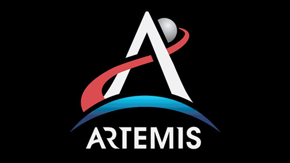
Revealed in 2019, the Artemis logo was developed by an internal NASA design team, with the broader branding ecosystem—including typography and layout assets—later refined by the agency Design Bridge. The central element of the logo is a bold, upward-pointing "A" that doubles as a vector. This dual functionality is intentional; the "A" represents the name of the program while the shape functions as an arrow, symbolizing the hunter’s bow and arrow associated with the Greek goddess Artemis.
The logo’s color palette and geometric components are divided into three distinct zones: Earth, the Moon, and Mars. At the base of the design is a blue crescent. This represents Earth, the starting point of all human spaceflight. The choice of blue is a direct reference to the "Blue Marble" perspective of our planet from space, emphasizing the vast oceans that define Earth’s appearance. Within the visual metaphor of the logo, this blue curve also serves as the bow from which the Artemis arrow is launched, suggesting that the mission’s energy and momentum are derived from the collective effort of the home planet.

Above the Earth sits a grey semicircle, representing the Moon. The tip of the "A" slices through this lunar arc. Critically, the arrow does not terminate at the Moon; it extends beyond it. This is a deliberate design choice to communicate that while the Moon is the immediate destination, it is not the final one. The ultimate objective is Mars, which is represented by a red trajectory line that forms the crossbar of the "A." The red color is a factual nod to the iron-oxide-rich soil of the Red Planet. This trajectory moves from left to right, disappearing into the distance to signal the long-term goal of deep-space exploration.
Mythology and the Apollo Legacy
The naming of the program as "Artemis" was a strategic decision to bridge the gap between NASA’s past and its future. In Greek mythology, Artemis is the twin sister of Apollo and the goddess of the Moon. This choice provides a direct lineage to the Apollo program, which successfully landed twelve men on the Moon between 1969 and 1972. By choosing Artemis, NASA signaled a commitment to continuity while highlighting a new era of inclusivity, as the program specifically aims to land the first woman and the first person of color on the lunar surface.
The Artemis logo pays direct homage to the Apollo mission patch, which was adopted in 1965. The Apollo logo featured a stylized "A" with a trajectory line representing the goal of "putting a man on the moon and returning him safely to the Earth," as famously articulated by President John F. Kennedy. However, the Artemis design updates this concept for the 21st century. Where the Apollo trajectory was a loop back to Earth, the Artemis trajectory is a linear path forward. As NASA officials stated during the 2019 reveal, the goal is to "forge our own path" and use lunar exploration as a stepping stone to the rest of the solar system.
A Chronology of the Artemis Program
The development of the Artemis brand has coincided with a rigorous schedule of hardware testing and policy shifts. The program’s timeline reflects the complexity of modern aerospace engineering and international diplomacy:
- December 2017: President Donald Trump signed Space Policy Directive 1, which formally tasked NASA with returning humans to the Moon for "long-term exploration and use."
- May 2019: NASA Administrator Jim Bridenstine officially announced the name "Artemis" and revealed the mission logo.
- October 2020: The Artemis Accords were established, a set of international agreements between the U.S. and other nations to govern the sustainable and peaceful exploration of the Moon.
- November 2022: Artemis I launched successfully. This uncrewed flight test of the Space Launch System (SLS) rocket and the Orion spacecraft traveled 1.3 million miles, orbiting the Moon before returning to Earth. This mission validated the heat shield and deep-space life support systems.
- Expected 2025/2026: Artemis II is scheduled to carry a crew of four—including astronauts Reid Wiseman, Victor Glover, Christina Koch, and Jeremy Hansen—on a flyby of the Moon.
- Expected 2026 and beyond: Artemis III aims to land a crew near the lunar South Pole, a region believed to contain water ice that could be harvested for life support and fuel.
The Science of the Typography
Beyond the logo, the Artemis branding system utilizes a bespoke typeface that reinforces the program’s "cinematic" and "dynamic" themes. This font is a modified version of Inter Sans Semi-Bold. The most notable modification is the inclusion of "missing" slices in the letters, cut at a precise 60-degree angle.
According to the design team, this 60-degree angle is not arbitrary. It represents the specific geometric balance required when two planetary bodies are in gravitational harmony. This technical detail serves to ground the artistic choices in the realities of orbital mechanics. For standard communications, NASA continues to utilize Helvetica and Garamond, but the Artemis-specific font is reserved for high-profile mission assets, ensuring that the program has a distinct visual voice within the larger NASA hierarchy.
Strategic Implications and Public Engagement
The investment in a high-fidelity branding system for Artemis serves a critical strategic purpose. Unlike the Apollo era, which was fueled by the Cold War "Space Race" and massive federal spending (peaking at nearly 4% of the U.S. federal budget), the Artemis program operates in a more complex economic and political environment. Branding is a tool for public engagement, helping to secure the multi-billion dollar funding required for the program’s success.
The Space Launch System (SLS), the primary rocket for Artemis, is the most powerful launch vehicle NASA has ever built, producing 8.8 million pounds of thrust—15% more than the Saturn V. However, with costs estimated at over $2 billion per launch, the program requires sustained public and congressional support. A cohesive and inspiring visual identity helps translate these abstract, high-cost engineering feats into a narrative of human progress that the public can follow and support.
Furthermore, the Artemis program is built on international cooperation. As of 2024, more than 35 nations have signed the Artemis Accords. The logo and branding act as a "flag" for this coalition, representing a collective human endeavor rather than a purely nationalistic one. This is reflected in the inclusion of international astronauts in the Artemis II crew, such as Jeremy Hansen of the Canadian Space Agency (CSA).
Broader Impact and Future Outlook
The Artemis logo represents more than a series of upcoming flights; it symbolizes a fundamental shift in how humanity interacts with space. While Apollo was about "flags and footprints"—short-duration visits to prove capability—Artemis is about "sustained presence." The branding reflects this by emphasizing the trajectory toward Mars.
NASA’s plan involves the construction of the Lunar Gateway, a small space station that will orbit the Moon and serve as a communication hub and temporary habitation for astronauts. This "stepping stone" philosophy is embedded in the logo’s design, where the Moon is a gateway rather than a finish line.
As the program moves toward the Artemis II crewed mission, the logo will become increasingly ubiquitous, appearing on everything from flight suits and spacecraft hulls to educational materials and consumer merchandise. Its success as a piece of design will be measured by its ability to inspire a new generation—the "Artemis Generation"—in the same way the meatball and worm logos inspired the scientists and engineers of the 20th century. By weaving together mythology, history, and the cold mathematics of spaceflight, the Artemis identity serves as a visual bridge to a future where human life on other planets is no longer a matter of science fiction, but of strategic planning and engineering reality.


